Aarambha Real Estate
Table of Contents
- 1.Free Features
- 2.Pro
Follow the steps below to get started with your WordPress Theme
- Now log in to the WordPress admin dashboard.
- Go to Appearance> Themes > Add New > Upload theme.
- Upload real-home.zip and Activate themes.
- After theme activation, you will get a notification to install and activate the required plugins.
- Click on Begin installing plugins.

- Install and Activated plugins.
- Install and activate the Aarambha Demo Sites plugin. which helps you to import demo data on your site.
- After that, you will found the Import Demo nav in the dashboard.

- Likewise, Install Contact Form 7 plugin and Click on Import Demo You will get the available demo.
- choose one demo and import it. you can follow the method shown in this video.
- Inside Global > Color, you will see various color options. For example: If you change the color of the Link (Global > Color > Link), you can see the instant color change in all the places where you have used Link.

- Go to Global > Typography, where you can choose your favorable Font Family and Font Weight.

To set site background as color or image by just choosing button, visit Global > Body.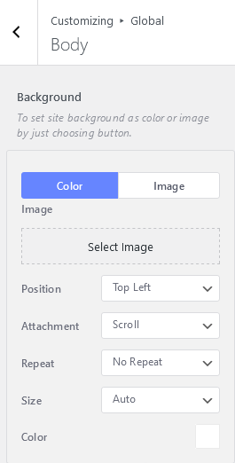
- You can change the width of the website Container as per your wish. Just click on Global > Container, and set the width as per your need.

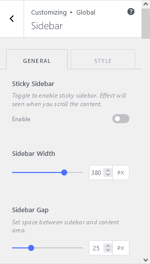
- To make your sidebar sticky, Go to Global > Sidebar.
- You can either enable or disable this feature. But, in default it is disabled.

- It is to set a Placeholder Image and Color for no featured image is set.

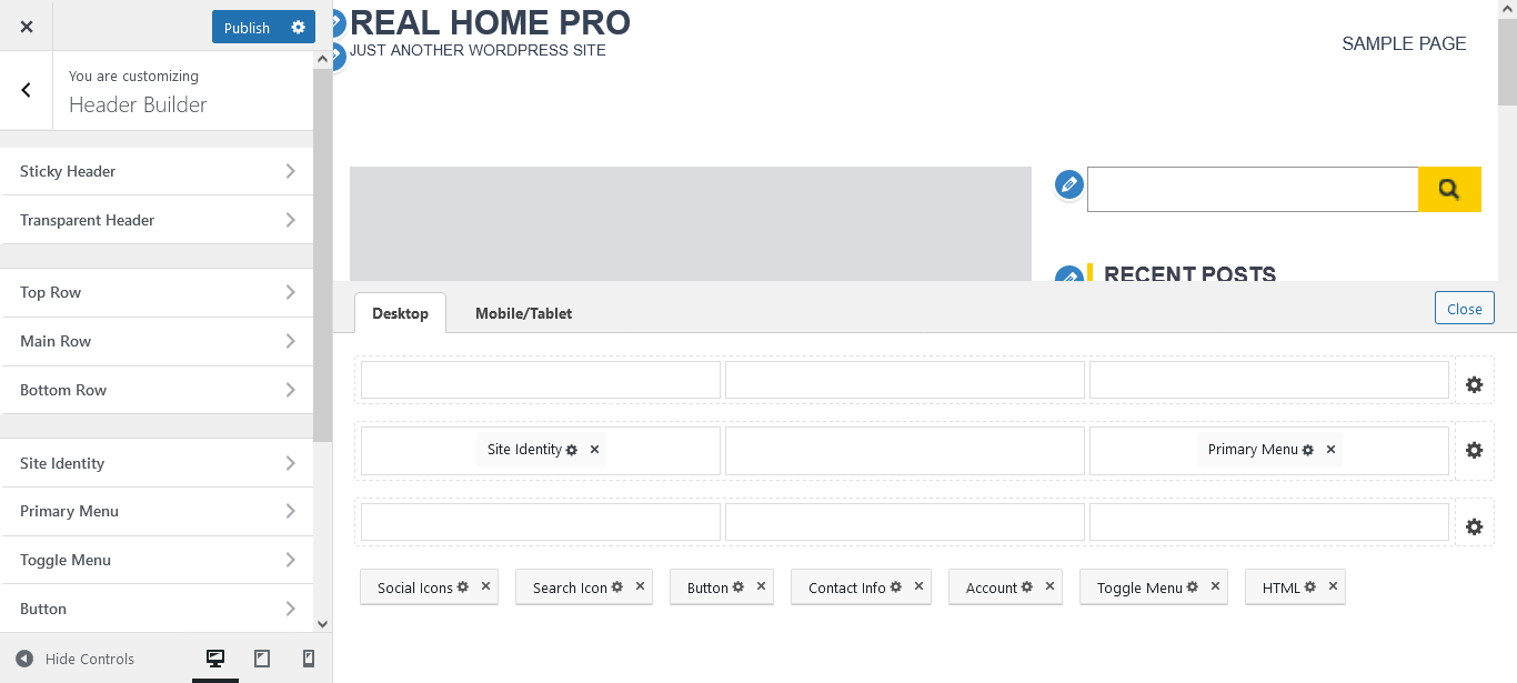
- Header Builder is the unique feature of this theme. Mostly, you won’t find this feature in themes.
- Inside Customization > Header Builder, there are the following customization options:

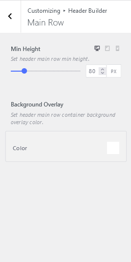
Click on Customization > Header Builder > Bottom Row, there you can set Min Height and Background Overlay.
Inside Header Builder > Site Identity, there are general settings and styles.
- Site Identity covers,

- Likewise, you can customize the following styles,

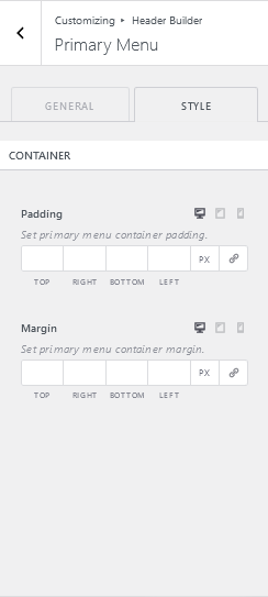
To set Menu, Go To Primary Menu. Where you can set value for the parent menu spacing. Also, there is an option to set the margin and padding of the primary menu container.
- Go to the Toggle Menu and click on the mobile menu to set the menu.
- Set Toggle Menu Container Padding and Margin.

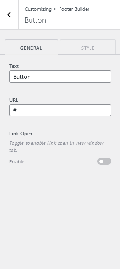
- Add text and URL from Header Builder > Button to set the link.
 You can toggle to enable the link to open in the new tab.
 - There are also multiple styling options available. Set the button size of your choice.

- Configure Social Icons from Global > Social > Social Icons. Similarly, enable open in new tab button.
 Visit the next tab to set styles on those social icons. There you will get the margin and padding options for containers and items.
There is an option to create login and logout text and url for user Account. Toogle button setting is also available there. Select Style tab to fix border width, padding, and margin.
It helps you to set a Search Model box placeholder. You can also manage search container margin and padding.
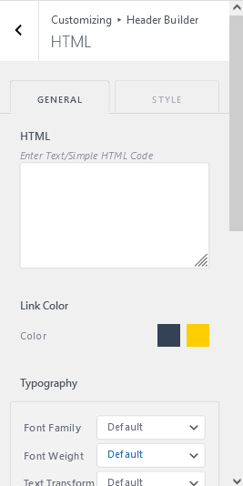
You can add custom HTML code to your header section throughout here. Together, the CSS option is also available.
Set footer top row container background image from Footer Builder > Top Row. There You’ll get to set the background image, position, size, attachment, overlay color, padding, etc.

Here is to set footer main row container background image. Additional settings are also available altogether.

Footer bottom row container background overlay color and padding can be set from Footer Builder > Bottom Row.

to set the copyright text on your website.
Go to Footer Builder > Copyright.

Switch to style setting for margin and padding management.

- Configure social icons in Global > Social > Social Icons.
- Toggle to enable link open in new window tab.
- Set social container padding.
- Set social container margin.
- Set each item padding.
- Set each item margin.

- Add buttons to your site footer from Footer Builder > Button.
- Toggle to enable link open in new window tab.
- Set button border width.
- Set button padding.
- Set button margin.

- You can manage Footer Menu from Footer Builder > Footer Menu. To create Footer Menu click on the given link and it will redirect you to Customize > Menus > View All Locations.
- Fix Menu Spacing and container margin, padding over here.

With this theme, you can add multiple Footer Sidebars to your website. Choose one of the Footer Sidebar and drag & drop widgets you wanna add there. The same goes for Footer 2, 3, 4, 5, and 6.
Page Header lets you enable lists of page header elements and re-arrange their order by drag & drop with orders.
Post Content has:
- Enable lists of blog post content elements and re-arrange their order by sorting with drag & drop.
- Enable lists of post meta and re-arrange their order by sorting with drag & drop.

This theme includes aspect ratio and image size on the custom featured image section.
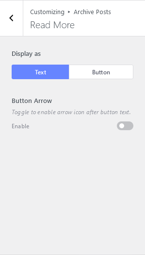
Read More section makes your website more user-friendly.
- You can display the Read More section to Display as Text and Display as Button.
- Also, enable the arrow icon after button text.
The sidebar layout allows you to set blog/archive pages. You can choose the best layout for your posts.
Page header lets you to:
- Enable lists of social share and re-arrange their order by sorting with drag & drop.
- Enable lists of post meta and re-arrange their order by sorting with drag & drop.

Post Content has:
- Header elements to enable lists of post header elements and re-arrange their order by drag & drop with orders.
- Footer Elements enable lists of post footer elements and re-arrange their order by drag & drop with orders.

Featured Image has customization options to manage aspect ratio and image size.
- Set custom aspect ratio for featured image. Upload proper image aspect ratio and size for better appearance.
- Selecting a bigger image size will increase image appearance quality but takes more time to load a website.
Property Archive Posts has the following options to customize:
- Page Header
- Post Content

Page Header enables you to sort elements.
- Enable lists of page header elements and re-arrange their order by drag & drop with orders.

Inside Post Content, choose Image Size wisely. Selecting a bigger image size will increase image appearance quality but takes more time to load the website.

On Customize > Property Single Post, you can manage:
- Page Header
- Post Content
- Related Properties

Inside Page Header, you can sort elements and post meta elements.
- Enable lists of social share and re-arrange their order by sorting with drag & drop.
- Enable lists of post meta and re-arrange their order by sorting with drag & drop.

Inside related properties, there are enable related posts option, the number of posts to show, and image size option.

Agent Single Post comes with three customization options. Follow the list below:
- Page Header
- Post Content
- Related Properties

Page Header enables lists of page header elements and re-arranges their order by sorting with drag & drop.

Inside related properties, you can choose how many posts per page to show and customize the image size.

To manage FrontPage, go to Customize > FrontPage. You can see the various customization options to manage the front page of your website.
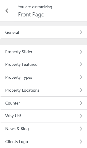
- To activate the Font Page, make sure to set the WordPress Front Page Displays option to use a static page.
- You can also sort the order of elements to make it more favorable.

With the help of the property slider, you can enable sliders as well as set the slides limit.

- To feature listings, you can go to the Front Page > Property Featured.

- There is also a styling section. From which you can manage background image and background overlay.


With Property Types, you can enable a toggle button from which you can view all posts. Similarly, you can set how many posts you want to display there.

You can also set section container background image and background overlay color.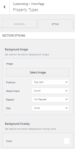
Property Location can be customized with post limits, view all toggle buttons, and button links.

Manage Styling for these sections can be done with the following properties:

This feature is used to set the counter items of the properties. You can see the sample of counter items. Also can add new counter items.

Section styling can also add to the counter items.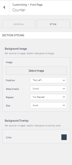
Why Us section is to describe the best services you provide to your customers.
Similarly, you can give a good look at this section using styling.

- Inside Frontpage > News & Blog, you can manage your latest posts and blogs. There is a post limit, category, author name, post title, excerpt, etc to manage.
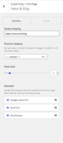 There is a style section where you can manage background images, overlay color, position, image size, etc.
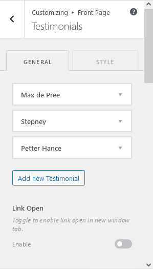
Aarambha Real Estate provides you a space to add all of your clients’ logos to the website. You can also add your new clients under the section Our Partners.

You can also customize this section using suitable styles. Switch to the Style tab.

To customize a single page, visit Customize > Single Page.

There are various customization options available for a single page.
Enable lists of page header elements and re-arrange their order by sorting with drag & drop.

Page content enables you to add Post title on the header section and comments in footer elements.

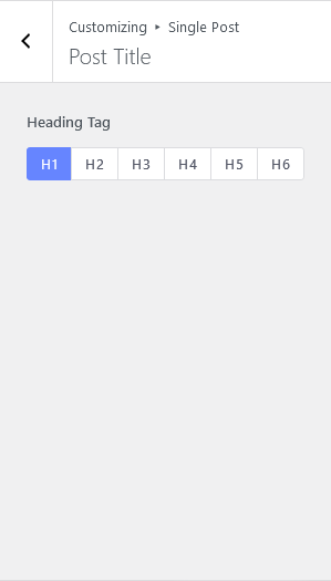
Visit Single Page > Page Title, where you can see the options to choose the heading tag. You can pick one according to the header type.
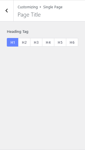
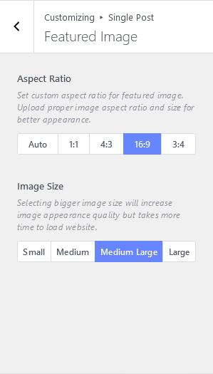
Inside Single Post > Featured Image,
- Set custom aspect ratio for featured image. Upload proper image aspect ratio and size for better appearance.
- Choose a suitable image size. Selecting a bigger image size will increase image appearance quality but takes more time to load the website.

404 page appears when there is no URL for the client’s searching result. It is to keep users on your site even if the result is not found.

- Go to 404 Page > Page Header to customize the 404-page header.
- Enable lists of page header elements and re-arrange their order by sorting with drag & drop.
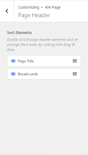
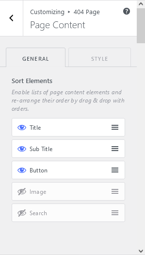
- Enable lists of page content elements and re-arrange their order by drag & drop with orders.
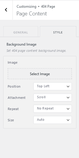
- Select Image that you want to show on the error page.

- Set a 404-page content background image. Position, Attachment, repeat, size options are also available for background image customization.
To customize menus, go to Customize > Menu.
- There you can add menus into the navbar or footer.
- You can create a new menu.
- You can also view all menu locations available. Your theme can display menus in 3 locations.

- To add menus in the footer section, add menu items into the footer menu.
- Reorder the items and add new items to the list.
- You can add menu items from the pages or can create custom links.

- To add items to Navbar, click add on Navbar Menu/ Primary Menu.
- There is add new items button as well as reorder items button.
- You can also see where all this menu appears. If you’d like to change that, pick another location
 .
.
To create a new menu, visit the link on Menus > Create New Menu.
- Give a suitable name for the menu. If your theme has multiple menus, giving them clear names will help you manage them.
- Choose Menu Location. If you plan to use a menu widget, skip this step.

Your theme can display menus in 3 locations. Select which menu appears in each location. If your theme has widget areas, you can also add menus there. Visit the Widgets panel and add a “Navigation Menu widget” to display a menu in a sidebar or footer.

Your theme has 1 other widget area, but this particular page doesn’t display it.
You can navigate to other pages on your site while using the Customizer to view and edit the widgets displayed on those pages.

You can now add any block to your site’s widget areas. The theme supports all of your favorite widgets still work flawlessly.

The Aarambha Real Estate Theme provides different “block” areas for you to add and edit content. Try adding a search bar, social icons, or other types of blocks here and see how they’ll look on your site. You can add required widgets into Footer Sidebar 2,3,4,5, and 6 as well.
You can choose what’s displayed on the homepage of your site. It can be posted in reverse chronological order (classic blog), or a fixed/static page. To set a static homepage, you first need to create two Pages. One will become the homepage, and the other will be where your posts are displayed.

Add your own CSS code to customize the appearance and layout of your site. Visit Customizing > Additional CSS to add code.

If your site is under development or you are revamping your website. You can use this feature to keep users engaging.

Activate Section is to activate the coming soon feature into your site. Here you can add any images with text content with your own choice of color, shape, and size.

You can add your logo at the header side of the coming soon page. Just go to the Coming Soon > Header.

Content section is to add different kinds of contents in the coming soon page. Such as count down time, title, shot description, date, etc.

Here you can enable lists of footer elements and re-arrange their order by sorting with drag & drop.

Inside Global settings, you can customize color, typography, container, button, page header, etc.

Go to Global > Colors,
- Accent Color: You can set primary and secondary colors for accent.
- H1-H6 Color: It is to set the color on Heading Tag.
- Text Color: To customize the text color, click here.
- Link Color: To set the color on the link for normal, hover, and visited, click on Link Color.
- Background Color: Here is to set the background color.
Inside Global > Typography,
- Set base typography for the site.
- Set section heading typography for page content.
- Set post title, property price or element title typography for the page content.
- Set post excerpt, element short description typography for the page content.
- Post Meta with Background.
- Post Meta without Background.
You can set background in the body content from here.
To set site background as color or gradient color or image by just choosing button.
You can customize Container here.
- Max Width: Set container max width. Default value is 1170px.
- Spacing: Set container left and right padding.
- Boxed Layout: Toggle to set box layout. Style options are available only for Boxed Layout enabled.
- Vertical Spacing: Set container top and bottom margin.

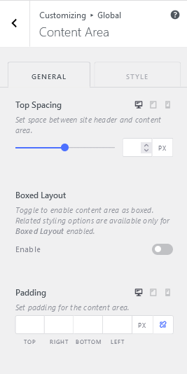
Content Area consists:
- Top Spacing: Set space between site header and content area.
- Boxed Layout: Toggle to enable content area as boxed. Related styling options are available only for Boxed Layout enabled.
- Padding: Set padding for the content area.
- Background: Set content area background as color or gradient color or image after enabling box layout.
- Border: Set content area border.
- Box Shadow: Set content area box-shadow.
Go to Global > Typography, you’ll see:
- Font Family, Font Weight, Text Transform, Font Size, Letter Spacing.
- Text Color, Background Color.
- Border Width, Style, and radius.
- Box Shadow.
- Padding.

Page Header brings out:
- Container Padding: Set page header container padding.
- Container Alignment: Set page header content alignment as left, center, or right position.
- Background Image: Set page header container background image.
- Background Overlay: Set page header container background overlay as color or gradient colors.
- POST/PAGE/ARCHIVE TITLE
- Font Color: Set post/page/archive-title font color.
- Typography: Set post/page/archive-title font properties.
- Spacing: Set post/page/archive-title bottom spacing.
- Breadcrumb
- Active Color: Set breadcrumb active font color.
- Font Colors: Set breadcrumb normal and hover font colors.
- Typography: To set font-family, font-weight, text-transform, font size, letter spacing.
- Item Gap: Set the gap between each item of the breadcrumb.
- Item Separator Gap: Set a separator gap between each item of the breadcrumb.
- Separator Size: Set each item separator size.
- Spacing: Set breadcrumb bottom spacing.

- Social Share
- Icon Colors: Set social share icons colors.
- Background Colors: Set social share icons background colors.
- Icon Border: width, style, color, radius.
- Item Gap: Set a gap between each item of the social share.
- Social Share: Set social share bottom spacing.
- Post Meta
- Author Avatar: Enable to show author avatar image. Disable this setting to show a custom icon if the below meta icon setting is enabled.
- Post Meta Icon: Enable show on desktop option.
- Icon Color: Set post meta icon color.
- Font Colors: Set post meta font colors.
- Typography: customize typography settings from here.
- Post Meta: Set post meta bottom spacing.
- Archive Description
- Font Color: Set archive description font color.
- Typography: Set typography for archive description.
- Description: Set description bottom spacing.
- To make the sidebar sticky, enable the button and the effect will be seen when you scroll the content.
- Set sidebar width and the space between sidebar and content area.
- Widgets Gap: Set space between each widget within the sidebar.
- Background: Set sidebar container background.
- Border: Set sidebar container border.
- Box Shadow: Set sidebar container box-shadow.
- Padding: Set sidebar container padding.
- Widget Styling: Set widget title box color, typography for sidebar widget title, typography for sidebar widget content, set each widgets wrapper background, wrapper border, box-shadow, and padding.
Enable lists of social share and re-arrange their order by sorting with drag & drop.
- You can also add new social links and set Icons for them.
- Toggle to enable/disable for the link open in the new window tab.
- Change Social Share Icon color and background color appropriately.

To Customize Placeholder Image:
- Set placeholder color for no featured image is set.
- Set placeholder image for no featured image is set. The image will replace the placeholder holder color.
- Enable/disable placeholder in the blog, archive, author, search, custom post, and custom taxonomies pages for the entire site.
- Enable/disable placeholder in singular or custom singular pages for the entire site.

To make the Header sticky while scrolling, check out on Header Builder > Sticky Header. There are multiple options for making a sticky header.
- Yes – Only Main Row: To make only the main row sticky.
- Yes – Top and Main Row: Make both top and main row sticky.
- Yes – Only Top Row: Set the top row as sticky.
- Yes – Only Bottom Row: Choose only the bottom row to be sticky.
- Yes – Whole Header: Make the whole header sticky.

Customization options available for Transparent Header are:
- Toggle to enable a transparent header for the complete website.
- Toggle to disable transparent header only for archive pages such as categories, tags, search, author page.
- Toggle to disable transparent header only for blog or static blog page.
- Toggle to disable transparent header only for all singular pages.
- Toggle to disable transparent header only for all singular posts page.

Top Row has:
- Container Layout options: Standard, Full Width, Contained
- Header top row min-height.
- Choose position for the content in the Left Column.
- Choose position for the content in the Center Column.
- Choose position for the content in the Right Column.

The Main Row also has:
- Container Layout Options: Standard, Full Width, Contained.
- Header main row min-height.
- Choose position for the content in the Left Column.
- Choose position for the content in the Center Column.
- Choose position for the content in the Right Column.

Customize Bottom Row with:
- Container Layout: Standard, Full Width, Contained.
- Header main row min-height.
- Choose position for the content in the Left Column.
- Choose position for the content in the Center Column.
- Choose position for the content in the Right Column.
- Header bottom row container background image.
- Header bottom row container background overlay as color or gradient colors.
- Header bottom row container border.
- Header bottom row container box-shadow.
- Header bottom row container padding.

Edit Site Identity from here. There you can see:
- Logo: To set site logo.
- Site Title: Enable/Disable Site Title and add title.
- Tagline: Add tagline and if you don’t want to add disable the option.
- Site Icon: Enable Site Icon feature and add icon.
- Styles: Edit Style for site title and tagline as well as container.

- Visit Header Builder > Primary Menu.
- To set menu, go to Primary Menu>
- or, Select Menu.
- Change the value to set parent menu spacing.
- Toggle to enable the menu to stretch and fit the width of its parent column.
- Toggle to enable/disable dropdown items.
- Set dropdown menu container width.
- Set Top offset for the dropdown container.
- Go to the Style tab to customize CSS.

Just Like in the Primary Menu, to customize Toggle Menu, go to Mobile Menu.
Else, Select Menu.
- Likewise, Toggle to enable/disable submenu items.
- Set menu container custom width.
- Set the top offset for the menu container.
In Style Tab,
- Set trigger menu icon color, border, box-shadow, and padding.
- Set menu & submenu text typography.
- Set menu item container Background.
- Set toggle menu container padding and margin.

- Set button as text, icon, or both. Choose button Text, Icon, and URL.
- Set button icon size.
- Set Typography.
- Toggle to enable link open in new window tab.
- Set the style to buttons as per your choice.

- Configure social icons in Global > Social > Social Icons >
- If you’ve already configured it, choose icons to display as text, Icon, or both.
- Set social icon size from Icon Size.
- Set Text Typography.
- Toggle to enable link open in new window tab.
- Set social container padding.
- Set social container margin.
- To customize Items,
- Set each item’s icon and text as the same color.
- Set each item’s background color.
- Set each item border.
- Set each item box-shadow.
- Set each item padding.
- Set each item margin.

To add the Contact Info to your website, go to Header Builder > Contact Info.
- Click add button to add a new contact item.
- Toggle to enable link open in new window tab.
- Set icon position and size.
- Customize the gap between icon and content details.
- Add contact info icon color.
- Change contact info icon border.
- Set contact info icon padding, link color, and text color.
- Enable lists of contact info elements and re-arrange their order by drag & drop with orders.
- Title and subtitle Typography, spacing, and margin.
- Container Margin, padding.

- Create Login URL and toggle to disable author avatar and replace with font awesome icon.
- Set Logout URL.
- Set account display as text, icon, or both.
- Add icon position and gap between icon and text.
- Configure account icon size.
- Toggle to enable link open in new window tab.

Set search model box placeholder from Header Builder > Search Icon.
Also, configure button icon size. For more CSS customization, you can switch to the Style Section.

Enter Text/Simple HTML Code to customize manually. Select Link color and set typography settings.
There are also sections for HTML container margin and padding.
To customize the footer section, edit Footer Builder by choosing one of the suitable options for your website.

Set Container Layout as Standard, Full Width, or Contained.
- For top row left column content position, choose between Start, Center, or End options.
- For top row center column content position, choose between Start, Center, or End options.
- Similarly, set the top row right column content position, choose between by choosing the below options.
- Set column divider. This setting only applies if the row has two or more columns.
- Set each column padding.
- Set footer top row container background image, border, and padding.
- Pick footer top row container background overlay as color or gradient colors.

Just like in the Top Row, you can get similar customization steps inside Main Row too.

Similar to the Top Row and Main Row, Bottom Row also has a container layout, left, center, right column, column divider, padding, background image settings, border, etc.

- You can configure social icons in Global > Social > Social Icons >
- To choose how you want to display social icons on your site, choose one from the Display As section.
- You can also set social icon positions as Before or After.
- Set gap between icon and text.
- Icon Size to set Social Icon size.
- Toggle to enable link open in new window tab.
- Social Container padding and margin.
- Icon and text color, background color, text typography.
- Item border, box-shadow, item margin, and padding.

Set button as text, icon, or both and add button URL as well as icons. Along with this, you can see multiple CSS options.
- GAP: To set the gap between icon and text.
- Icon Size: Set button icon size.
- Link Open: Toggle to enable link open in new window tab.
- Button: Set button color.
- Background: Set button background.
- Text Typography: Typography settings for text.
- Border: Set button border.
- Box Shadow: Set button box-shadow.
- Margin: Set button margin.
- Padding: Set button padding.

- Click add button to add a new button item.
- Toggle to enable link open in new window tab.
- Choose no. of Columns per row.
- Toggle to set row container width to 100%.
- Set button icon size and button gap between icon and title.
- Set each button icon and text color.
- Text Typography.
- Button icon border, margin, Padding.

Go to Footer Menu to set the menu or select the menu.
- Change the value to set menu item spacing.
- Customize parent menu and container settings.

There are 6 places to set the footer sidebar in the theme. Drag and drop widgets into Footer Sidebar » widget area.

The same continues to all. i.e. Footer Sidebar 2, 3, 4, 5, and 6.
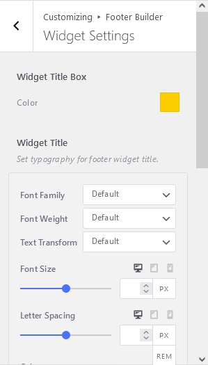
Go to Footer Builder > Widget Settings to customize widgets. There are multiple settings available:
- Widget title box: Set color.
- Widget Title: Set typography for footer widget title.
- Widget Content: Set typography for footer widget content.
- Padding: Set each footer widgets wrapper padding.
- Enable/disable scroll to top button from footer after window scroll.
- Set back to top button position as left, center, or right.
- Set scroll to top button icon colors, background colors, button, button border, and button box-shadow.

In Archive Posts, you will get to manage the following options as shown in the figure below;

Enable lists of page header elements and re-arrange their order by drag & drop with orders.
As well as set the background image and background overlay as color or gradient colors.

You can customize the way of adding post content into Archive Posts. To do so, go to Archive Posts > Post Content.

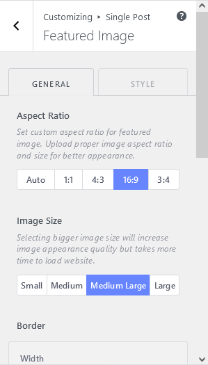
Select the custom aspect ratio for the featured image. Upload proper image aspect ratio and size for better appearance.
You can also choose what image size you want to upload (like small, medium, medium-large, large).
Also, manage border and box-shadow.

To manage the header size appropriately, select a suitable heading tag from Post Title.
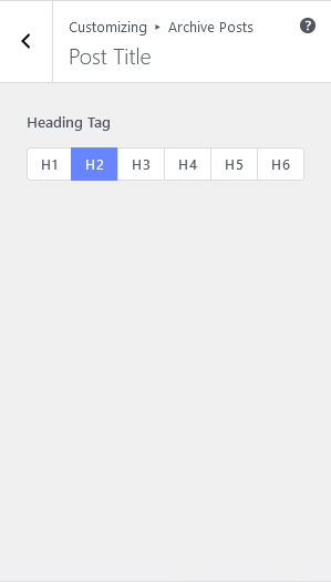
The excerpt is to highlight the important part of your posts. So, choose your excerpt length wisely from Archive Posts > Post Excerpt. Likewise, you can decide what to put in the suffix of the excerpt.

Visit Customizing > Archive Posts > Read More, to set Read More button/text, position, button arrow, etc.

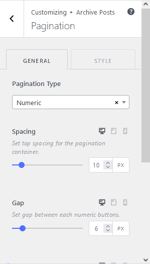
- Set pagination type: Next/Prev, Numeric, Load More Button, Infinite Scroll Button.
- Set top spacing for the pagination container.
- Set gap between each numeric buttons.
- Font Size, Button Text, Button Background.
- Sort Elements: Enable lists of social share and re-arrange their order by sorting with drag & drop.
- Post Meta Elements: Enable lists of post meta and re-arrange their order by sorting with drag & drop.
- Background Image: Set background image.
- Background Overlay: Set background overlay as color or gradient colors.

In Post Content, there are following elements:
- Header Elements: Enable lists of post header elements and re-arrange their order by drag & drop with orders.
- Footer Elements: Enable lists of post footer elements and re-arrange their order by drag & drop with orders.
- Featured Image: Set post featured image bottom spacing.
- Post Title: Set post title bottom spacing.
- Categories: Set post categories bottom spacing.
- Post Content: Set post content bottom spacing.
- Social Share: Set post social share bottom spacing.
- Comments: Set post comments bottom spacing.
- Tags: Set post tags bottom spacing.
- Post Navigation: Set post navigation bottom spacing.
- Author Box: Set author box bottom spacing.
- Related Posts: Set related posts bottom spacing.
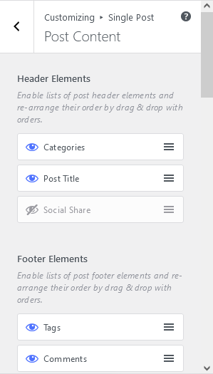
Inside Post Title, choose separate heading tag and implement in different sections.

Like as other Featured Image Settings, choose aspect ratio, and image size, border, and box shadow for image.
You can filter posts by Date, Category, or Tag inside Post Navigation. Also,
- Toggle to enable/disable next post and previous post label.
- Toggle to enable/disable next post and previous post arrow.
- Enable/Disable Post Title and Post thumbnail.
- Text color, background color, box shadow, etc.

- Enable lists of author box elements and re-arrange their order by drag & drop with orders.
- Set author name bottom spacing.
- Set author biographical info bottom spacing.
- Set author website bottom spacing.
- Set gap between author image and author details wrapper.
- Color on author name, author info, website, background color, border, box-shadow color, margin, padding, etc.

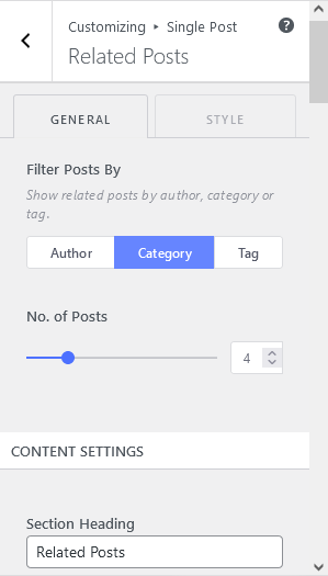
From Related Posts section, you can manage:
- related posts by author, category or tag.
- no. of posts
- content settings
- posts styling, and many more.
In this theme, there are proper places to introduce yourself/ your services in the front page.

To activate the Font Page, make sure to set the WordPress Front Page displays option to use a static page >
Enable lists of page header elements and re-arrange their order by drag & drop with orders.

Add new counters in to your website like property listings, agent listings, etc. You can also decide how many items to show in each column.

There are multiple section heading spaces to introduce clients about your services.

The theme has given a perfect space to showcase your latest news and blogs. Also, you can see the various CSS options altogether.

This section is to place the listing of your clients with their logo representation.

Subscribe Form generally helps to find you real clients and get connected with them.

Manage the single page of your website with the following features available in Aarambha Real Estate Pro.

Page Content helps to manage Header Elements, Footer Elements, spacing on several elements etc.

Set the perfect size, position, aspect ratio, etc of your featured image from this section.

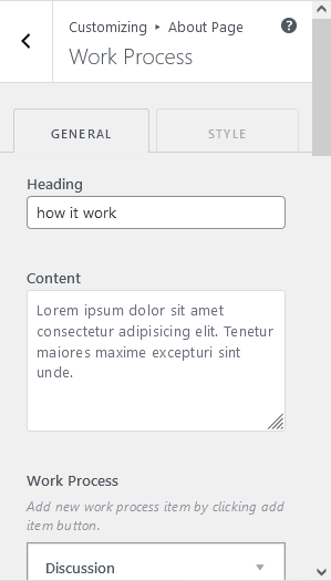
Add new work process item by clicking add item button or add description about your working process.
To check inherit counters go to Front Page > Counter >
Set counter wrapper section background image.

You can customize the page header and content section of error page. Which is also called 404 page.

Enable lists of page header elements and re-arrange their order by sorting with drag & drop.
Set Background image and overlay color or gradients.

Enable lists of page content elements and re-arrange their order by drag & drop with orders.
Default it allow 3 pricing items and its related settings. To add more, set slider value, save customizer value and Reload Customizer to reveal the settings.

Add pricing feature by clicking add item button. There are 3 pricing item adding sections.

To check inherit counters go to Front Page > Counter >
Similarly, Set counter wrapper section background image.

Create Menus to your site and place them in different positions that is really suitable to represent your business.

- Click “Add Items” to start putting pages, categories, and custom links in your menu. Add as many things as you’d like.
- Here’s also the places where this menu appears. If you’d like to change that, pick another location.
- You can also automatically add new top-level pages to this menu.

Your theme can display menus in 3 locations. Select which menu appears in each location.
If your theme has widget areas, you can also add menus there. Visit the Widgets panel and add a “Navigation Menu widget” to display a menu in a sidebar or footer.

Your theme has 1 other widget area, but this particular page doesn’t display it.
You can navigate to other pages on your site while using the Customizer to view and edit the widgets displayed on those pages.

Your theme provides different “block” areas for you to add and edit content. Try adding a search bar, social icons, or other types of blocks here and see how they’ll look on your site.

You can drag and drop different widgets into Footer Sidebar 1, 2, 3, 4, 5, and 6.

You can choose what’s displayed on the Homepage of your site. It can be posts in reverse chronological order (classic blog), or a fixed/static page. To set a static homepage, you first need to create two Pages. One will become the homepage, and the other will be where your posts are displayed.


