Business Aarambha
Table of Contents
- 1.Free Features
- 2.Pro
- 2.1.Coming Soon
- 2.2.Global
- 2.3.Header Builder
- 2.3.1.Sticky Header
- 2.3.2.Transparent Header
- 2.3.3.Top Row
- 2.3.4.Main Row
- 2.3.5.Bottom Row
- 2.3.6.Slide In Box Sidebar
- 2.3.7.Site Identity
- 2.3.8.Primary Menu
- 2.3.9.Mobile Menu
- 2.3.10.Slide In Box
- 2.3.11.Button
- 2.3.12.Social Icons
- 2.3.13.Contact Info
- 2.3.14.Account
- 2.3.15.Search Icon
- 2.3.16.HTML
- 2.3.17.WooCommerce Cart
- 2.3.18.WooCommerce Wishlist
- 2.4.Header Banner
- 2.5.Footer Builder
- 2.6.Blog/Archive Posts
- 2.7.Single Post
- 2.8.Single Page
- 2.9.404 Page
- 2.10.Menus
- 2.11.Widgets
- 2.12.Homepage Settings
- 2.13.WooCommerce
- 2.14.Additional CSS
- 2.15.Export/Import
Follow the steps below to get started with your WordPress Theme
- Now log in to the WordPress admin dashboard.
- Go to Appearance> Themes > Add New > Upload theme.
- Upload business-aarambha.zip and Activate themes.
- After theme activation, you will get a notification to install and activate the required plugins.
- Click on Begin installing plugins.
- Install and Activated plugins.
- Install and activate the Aarambha Demo Sites plugin. which helps you to import demo data on your site.
- After that, you will found the Import Demo nav in the dashboard.

- Likewise, Install Contact Form 7 plugin and Click on Import Demo You will get the available demo.
- choose one demo and import it. you can follow the method shown in this video.
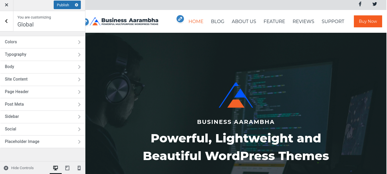
Inside Global > Color, you will see various color options. For example: If you change the color of the Link (Global > Color > Link), you can see the instant color change in all the places where you have used Link.
Go to Global > Typography, where you can choose your favorable Font Family and Font Weight.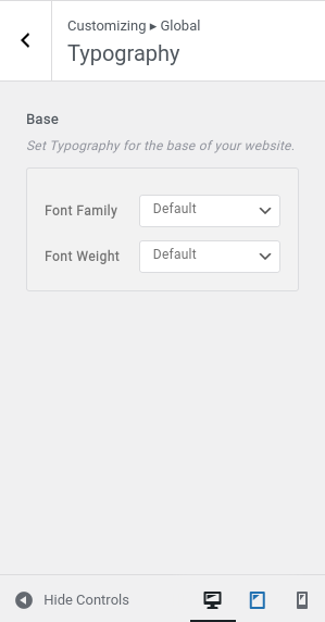
To set site background as color or image by just choosing button, visit Global > Body.
Set color in placeholder if there isn’t a featured image.
Or,
Set placeholder image for no featured image. It will replace the placeholder color.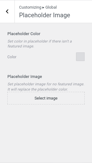
Inside Customization > Header Builder, there are the following customization options: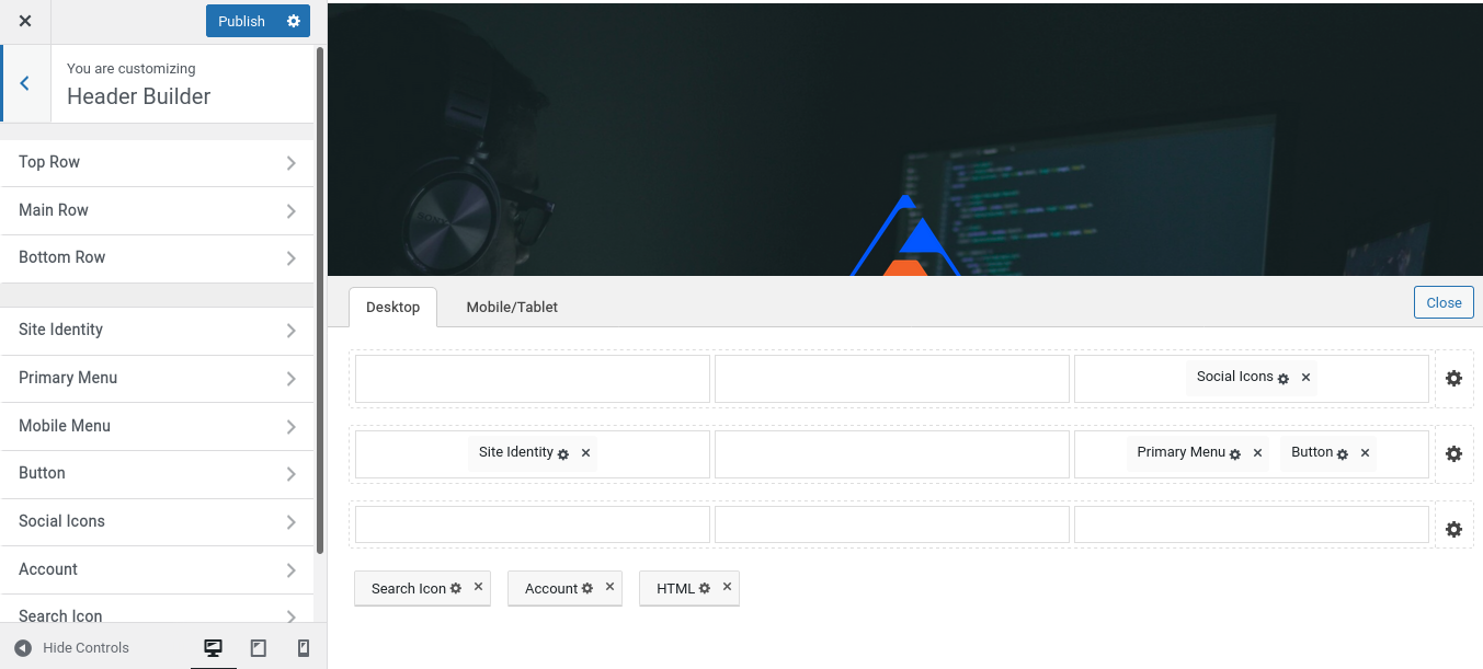
Click on Customization > Header Builder > Bottom Row, there you can set Min Height and Background Overlay.
Inside Header Builder > Site Identity, there are general settings and styles.
- Site Identity covers,
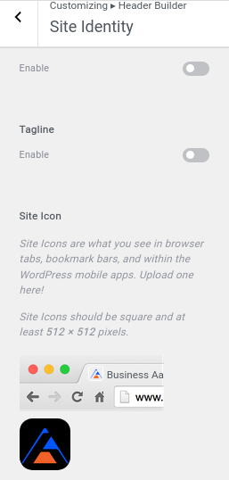
- Likewise, you can customize the following styles,

- To set Menu, Go To Primary Menu. Where you can set value for the parent menu spacing.
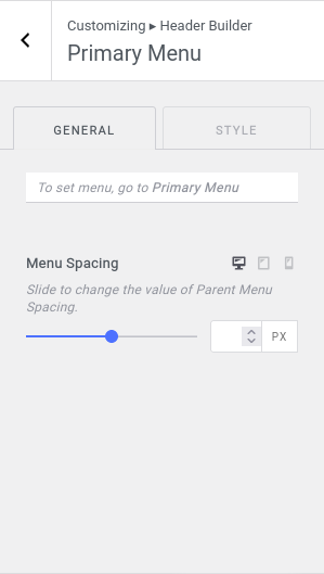
- Also, there is an option to set the margin and padding of the primary menu container.

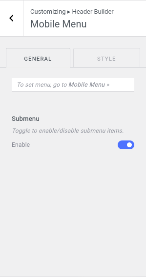
To set menu, go to Mobile Menu. To change Menu icon and background styles, go to style tab.

Add Buttons to your website to add links. To add style on buttons, switch to style tab.

- Configure social icons in Global > Social > Social Icons >
- If you’ve already configured it, choose icons to display as text, Icon, or both.
- Set social icon size from Icon Size.
- Set Text Typography.
- Toggle to enable link open in new window tab.

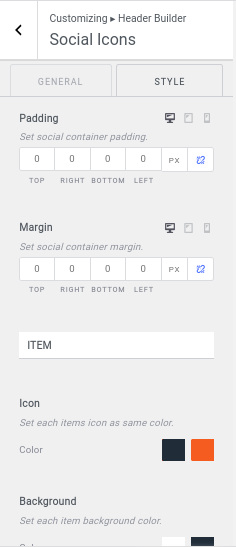
- Set social container padding.
- Set social container margin.
- To customize Items,
- Set each item’s icon and text as the same color.
- Set each item’s background color.
- Set each item border.
- Set each item box-shadow.
- Set each item padding.
- Set each item margin.
- Create Login URL and toggle to disable author avatar and replace with font awesome icon.
- Set Logout URL.
- Set account display as text, icon, or both.
- Add icon position and gap between icon and text.
- Configure account icon size.
- Toggle to enable link open in new window tab.

Set Search Model with placeholder.

Also, configure button icon size. For more CSS customization, you can switch to the Style Section.

Enter Text/Simple HTML Code to customize manually. Select Link color and set typography settings.

There are also sections for HTML container margin and padding.

Set header banner type as normal banner or banner as slider or none. Visit Header Banner > General,

Enable lists for blog post content elements and rearrange the order by drag and drop.
Post Content has:
- Enable lists of blog post content elements and re-arrange their order by sorting with drag & drop.
- Enable lists of post meta and re-arrange their order by sorting with drag & drop.

Add Read More section onto your posts. You can customize it as a button or text.

To customize the footer section, edit Footer Builder by choosing one of the suitable options for your website.
Set Container Layout as Standard, Full Width, or Contained.
- Choose position for the content in the Left Column.
- For top row center column content position, choose between Start, Center, or End options.
- Similarly, set the top row right column content position, choose between by choosing the below options.

- Set Background overlay color for top row container.
- Set footer top row padding.

Just like in the Top Row, you can get similar customization steps inside Main Row too.

Similar to the Top Row and Main Row, Bottom Row also has left, center, right column, padding, background overlay settings, etc.

You can insert some arbitrary HTML code tags: {current_year} and {site_title}
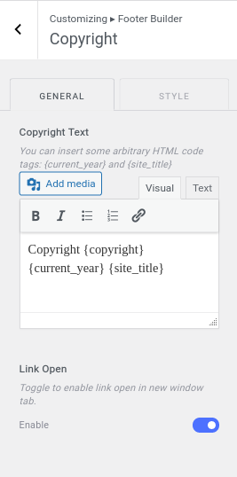
You can also customize copyright text color, padding, margin.

Configure social icons in Global » Social » Social Icons .
- Set gap between each social icon lists.
- Enable to open the link in the new tab.

- Set social container padding.
- Customize social container margin.
- Set each items icon and text as same color.
- Set each item background color.
- Set padding to each item.

Add buttons on footer section from here. You can also customize those buttons with CSS.

Add additional features with HTML code in here.

Also, add basic styles such as text color, link color, margin, padding to the added sections.
To set menu in footer section, go to Footer Menu.
Customize menu spacing with the slider.

Altogether, customize following sections on footer menu with styles:
- Font Colors: Set menu normal and hover colors.
- Background: Set menu each item background.
- Container Padding: Set Padding to the Footer Menu.
- Container Margin: Set Margin to the Footer Menu.

Go to Footer Builder > Widget Settings to customize widgets. There are multiple settings available:
- Widget Title: Choose suitable color for widget title.
- Widget Content: Customize normal and hover color for widget content.
- Padding: Set each footer widgets wrapper padding.

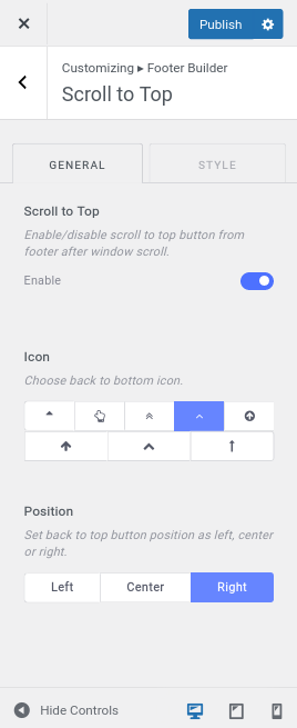
Add scroll to top button to navigate top content from bottom of the site. Enable button to scroll to top.

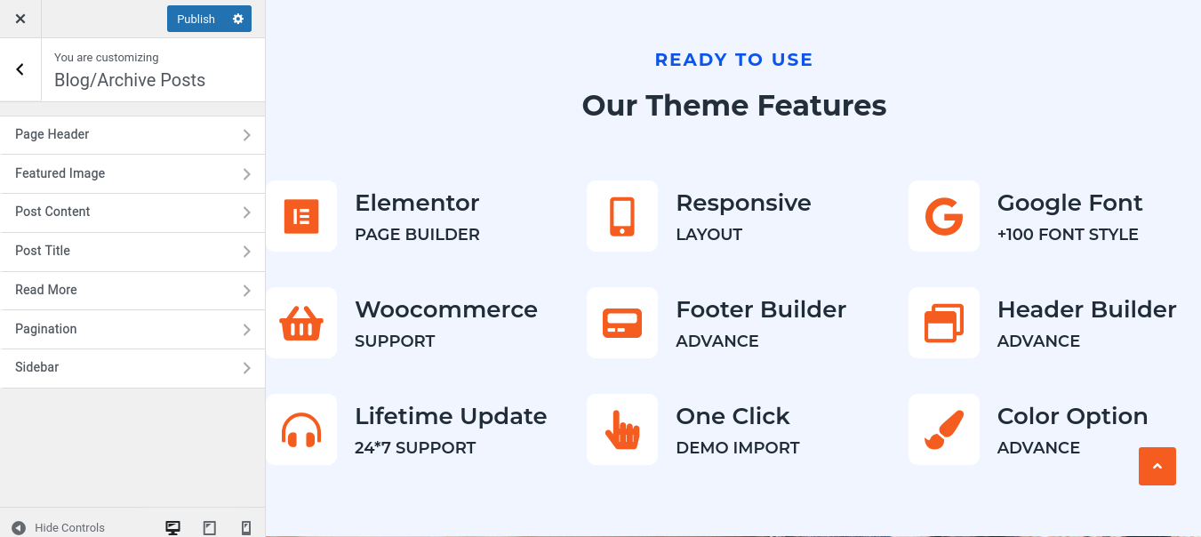
In Blog/Archive Posts, you will get to manage the following options as shown in the figure below;
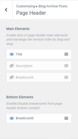
Customize Page Header main elements and bottom elements.
- Main Elements: Enable lists of page header main elements and rearrange the vertical order by drag and drop.
- Bottom Elements: Enable/Disable breadcrumb from page header bottom content.
Set custom aspect ratio for featured image. Choose proper aspects for better appearance.
Set proper size for featured image. Selecting a bigger image size may display a better appearance but takes more time on loading websites.

Enable lists for blog post content elements and rearrange the order by drag and drop.

Added pagination to each blog and archive posts. Select pagination type next/prev or numeric value.

To choose Sidebar Layout for blog/archive pages, go to Blog/Archive Posts > Sidebar.

Customize main and bottom elements for single post, page header.
- Main Elements: Enable lists of page header main elements and rearrange the vertical order by drag and drop.
- Bottom Elements: Enable/Disable breadcrumb from page header bottom content.

For featured post in single post, set aspect ratio and image size custom.
- Aspect Ratio: Select custom aspect ratio for featured image. Choose it wisely for better appearance.
- Image Size: Set proper size for featured image. Selecting a bigger image size may display a better appearance but takes more time on loading websites.

To customize post content of single post, go to Single Post > Post Content. There are following customization options:
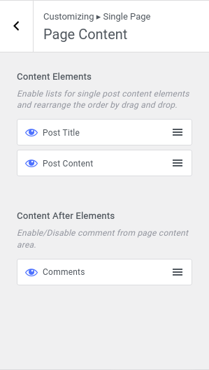
- Content Elements: Enable lists for single post content elements and rearrange the order by drag and drop.
- Content After Elements: To display lists Elements after post content, enable them. And sort them by drag and drop.

Visit Customize > Single Page. Customize Single Page with following customization settings:

For single page page header, there are two customization options:
- Main Elements: Enable lists of page header main elements and rearrange the vertical order by drag and drop.
- Bottom Elements: Enable/Disable breadcrumb from page header bottom content.

In single page featured image, choose aspect ratio and image size accordingly.
- Aspect Ratio: Select custom aspect ratio for featured image. Choose it wisely for better appearance.
- Image Size: Set proper size for featured image. Selecting a bigger image size may display a better appearance but takes more time on loading websites.

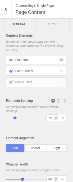
In Single Page > Page Content, you can edit:
- Content Elements: Set proper size for featured image. Selecting a bigger image size may display a better appearance but takes more time on loading websites.
- Content After Elements: Enable/Disable comment from page content area.
There are following options available to customize error pages:
- Main Elements: Enable lists of page header main elements and rearrange the vertical order by drag and drop.
- Bottom Elements: Enable lists of page header bottom overlay elements and rearrange the horizontal order by drag and drop.

- Enable lists of page content elements and re-arrange their order by drag & drop with orders.
- Select Image that you want to show on the error page.

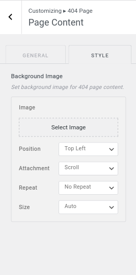
- Set a 404-page content background image. Position, Attachment, repeat, size options are also available for background image customization.
To customize menus, go to Customize > Menu.
- There you can add menus into the footer or Primary/Mobile menu.
- You can create a new menu.
- You can also view all menu locations available. Your theme can display menus in 3 locations.

Inside Footer Menu, you can add custom links for menus in different positions and reorder them.
Also, you can choose the menu locations where you want to add them. Likewise, you can enable menu options and automatically added new top-level pages to the menu.

In this theme, main menu options are currently set to Primary Menu and Mobile Menu. You can add custom links, choose menu location, as well as add new top-level pages to the menu.

Your theme can display menus in 3 locations. Select which menu appears in each location.
If your theme has widget areas, you can also add menus there. Visit the Widgets panel and add a “Navigation Menu widget” to display a menu in a sidebar or footer.

Your theme has 1 other widget area, but this particular page doesn’t display it.
You can navigate to other pages on your site while using the Customizer to view and edit the widgets displayed on those pages.

Display widgets on the footer section of the site.There are 6 footer sidebars that you can add on your website.

You can choose what’s displayed on the homepage of your site. It can be posts in reverse chronological order (classic blog), or a fixed/static page. To set a static homepage, you first need to create two Pages. One will become the homepage, and the other will be where your posts are displayed.
Your homepage displays:
- Your latest posts
- A Static Page

This theme is also suitable to integrate online store on your website. You can get Woo Commerce features support after installing Woo Commerce plugin.
You can enable store notice to display the text site-wide. You can use it to show events or promotions to visitors!
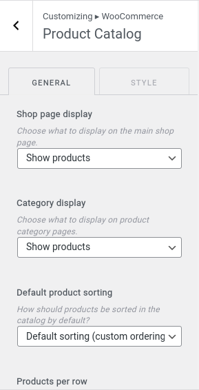
From Product Catalog, you can customize:
- Shop page display: Choose what to display on the main shop page.
- Category display: Choose items to display on product category pages.
- Default product sorting: Manage products sorting in the catalog by default.
- Products per row: You can customize number of products to display in row.
- Row per page: This is for number of rows of products to show per page.

Set respective sizes for images on product catalog. Images will display using the aspect ratio in which they were uploaded.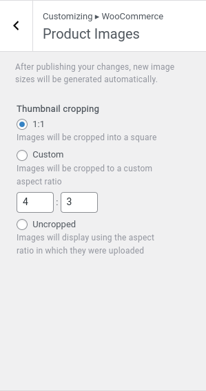
Add your own CSS code here to customize the appearance and layout of your site.

Click the button below to export the customization settings for this theme.
Likewise, Upload a file to import customization settings for this theme. You can also download and import images files.

If your site is under development or you are revamping your website. You can use this feature to keep users engaging.
Activate Section is to activate the coming soon feature into your site. Here you can add any images with text content with your own choice of color, shape, and size.![]()
You can add your logo at the header side of the coming soon page. Just go to the Coming Soon > Header.
![]()
Add title, short description, counter timer, launch date, label for day, hour, minute, and second.
You can also enable subscribe form. For this, you need to install and active Mailchimp for WordPress » plugin then drag and drop the Mailchimp Sign-Up Form to into Subscribe Form » register widget area.![]()
Enable lists of footer elements and re-arrange their order by sorting with drag & drop.
![]()
In global color settings, you can customize accent color, title color, base text, link color, etc.
Also, you can set post/page title colors for the page content.
Altogether, you can change post/page excerpt, content color for the page content.

Inside Global > Typography,
- Set base typography for the site.
- Set section heading typography for page content.
- Set post/page title, or element title typography for the page content.
- Set post/page excerpt, element short description typography for the page content.

For Site content properties, there are:
- Site As Boxed: Toggle to site as box layout. Style options are available only for Boxed Layout enabled.
- Site Width: Set site max width. Default value is 1170px.
- Site Container Spacing: Set site container left and right spacing.
- Content Area Top: Set site content area top spacing.
- Content Area Bottom: Set site content area bottom spacing.

Go to Global > Typography, you’ll see:
- Font Family, Font Weight, Text Transform, Font Size, Letter Spacing.
- Text Color, Background Color.
- Border Width, Style, and radius.
- Box Shadow.
- Padding.

Page Header brings out:
- Main Content Alignment: Set page header main content alignment as left, center or right position.
- Elements Spacing: Set spacing for each page header element.
- Bottom Content Alignment: Set page header bottom content alignment as left, center or right position.
- Social Share:
- Gap: Set social share gap between each items.
- Background Size: Set background size that fits your screen size.
- Icon Size: Choose icon size for social share icons.
- Breadcrumb:
- Item Gap: Set gap between each items of the breadcrumb.
- Item Separator Gap: Set separator gap between each items of the breadcrumb.
- Separator Size: Set each item separator size.

Inside Global > Post Meta:
Elements: Enable Post Meta elements and rearrange lists using drag and drop.
Meta Icon: enable button to show on desktop.
Author Avatar: Enable to show author avatar image. Disable this setting to show custom icon if below meta icon setting is enabled.
Typography: Set post meta typography.
Font Colors: Set each meta font normal and hover colors.
Background Meta: Customize font color, background colors, padding.
In Sidebar, you can do following customization:
- Sticky Sidebar: Toggle to enable sticky sidebar. Effect will seen when you scroll the content.
- Sidebar Width: Slide to manage Sidebar width.
- Widgets Gap: Set space between each widgets within sidebar.
- Background: Set sidebar container background.
- Border: Set sidebar container border.
- Box Shadow: Set sidebar container box shadow.
- Padding: Set sidebar container padding.
- Widget Title: Set typography for sidebar widget title.

Add Social Icons with custom link and icons. Also, enable lists of social share and re-arrange their order by sorting with drag & drop.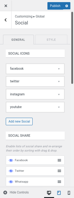
Set placeholder color for no featured image is set.
Set placeholder image for no featured image is set. Image will replace placeholder holder color.
Enable/disable placeholder in the blog, archive, author, search, custom post and custom taxonomies pages for entire site.
Enable/disable placeholder in singular or custom singular pages for entire site.

To make the Header sticky while scrolling, check out on Header Builder > Sticky Header. There are multiple options for making a sticky header.
- Yes – Only Main Row: To make only the main row sticky.
- Yes – Top and Main Row: Make both top and main row sticky.
- Yes – Only Top Row: Set the top row as sticky.
- Yes – Only Bottom Row: Choose only the bottom row to be sticky.
- Yes – Whole Header: Make the whole header sticky.
Set sticky header background as color or gradient colors.

Transparent Header has:
- Enable Complete Site: Toggle to enable transparent header for the complete website.
- Disable on Archive Pages: Toggle to disable transparent header only for archive pages such as categories, tags, search, author page.
- Disable on Blog Page: Toggle to disable transparent header only for blog or static blog page.
- Disable on Pages: Toggle to disable transparent header only for all singular pages.
- Disable on Posts: Toggle to disable transparent header only for all singular posts page.

Top Row has:
- Container Layout options: Standard, Full Width, Contained
- Header top row min-height.
- Choose position for the content in the Left Column.
- Choose position for the content in the Center Column.
- Choose position for the content in the Right Column.

The Main Row also has:
- Container Layout Options: Standard, Full Width, Contained.
- Header main row min-height.
- Choose position for the content in the Left Column.
- Choose position for the content in the Center Column.
- Choose position for the content in the Right Column.

Customize Bottom Row with:
- Container Layout: Standard, Full Width, Contained.
- Header main row min-height.
- Choose position for the content in the Left Column.
- Choose position for the content in the Center Column.
- Choose position for the content in the Right Column.
- Header bottom row container background image.
- Header bottom row container background overlay as color or gradient colors.
- Header bottom row container border.
- Header bottom row container box-shadow.
- Header bottom row container padding.

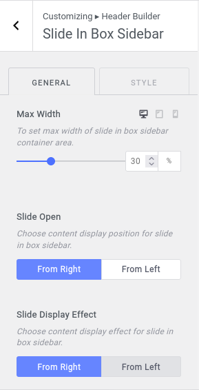
Inside header builder, you can add Slide In Box Sidebar.
It allows you to edit:
- Max Width: To set max width of slide in box sidebar container area.
- Slide Open: Choose content display position for slide in box sidebar.
- Slide Display Effect: Choose content display effect for slide in box sidebar.
- Body Background: Set body background color for slide in box sidebar container.
- Sidebar Background: Set Background color for slide in box sidebar container.
- Padding: Set slide in box sidebar container padding.
Edit Site Identity from here. There you can see:
- Logo: To set site logo.
- Site Title: Enable/Disable Site Title and add title.
- Tagline: Add tagline and if you don’t want to add disable the option.
- Site Icon: Enable Site Icon feature and add icon.
- Styles: Edit Style for site title and tagline as well as container.

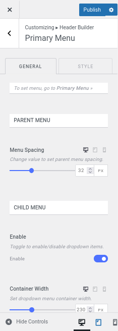
- Visit Header Builder > Primary Menu.
- To set menu, go to Primary Menu>
- or, Select Menu.
- Change the value to set parent menu spacing.
- Toggle to enable the menu to stretch and fit the width of its parent column.
- Toggle to enable/disable dropdown items.
- Set dropdown menu container width.
- Set Top offset for the dropdown container.
- Go to the Style tab to customize CSS.
- Choose slide in box toggle icon.
- Set slide in box toggle icon size.
- Set slide in box close icon size.
- Set icon normal and hover color.
- Set icon normal and hover background color.
- Set slide in box border.
- Set parent menu each item box shadow.
- Set slide in box padding.
- Set slide in box margin.
- Set slide in box container padding.
- Set slide in box container margin.
- Set close icon normal and hover color.
-
Set close icon normal and hover background color.
- Set slide in box close icon border.
- Set slide in box close icon box shadow.

- Set button as text, icon or both.
- Set button icon size.
- Toggle to enable link open in new window tab.
- Set button color, button background.
- Customize text typography, button border, button box shadow, margin, padding, etc.

Configure social icons in Global» Social » Social Icons »
Display social share items as icon, text, or both. You can also customize item gap as well as toggle to open the link on new tab.

Customize contact info by clicking add button to add new contact item.
- Toggle to enable link open in new window tab.
- Set icon position before or after text.
- Set contact info icon size.
- Enable lists of contact info elements and re-arrange their order by drag & drop with orders.
- Set space between title and subtitle.

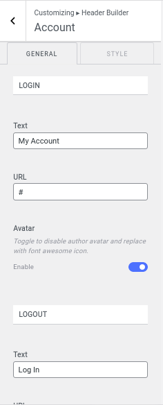
- Add login text and URL.
- Toggle to disable author avatar and replace with font awesome icon.
- Set account display as text, icon or both.
- Set icon position.
- Set gap between icon and text.
- Set account icon size.
- Toggle to enable link open in new window tab.
- Set search model box placeholder.
- Set button icon size.
- Set Icon color, background, border, box shadow, padding.
- Add Icon container margin, padding, model box.

To add the WooCommerce Cart to display products on your online store, go to Header Builder > WooCommerce Cart. You can manually set WooCommerce cart icon color, icon background, cart background, border, box shadow, margin, padding etc.
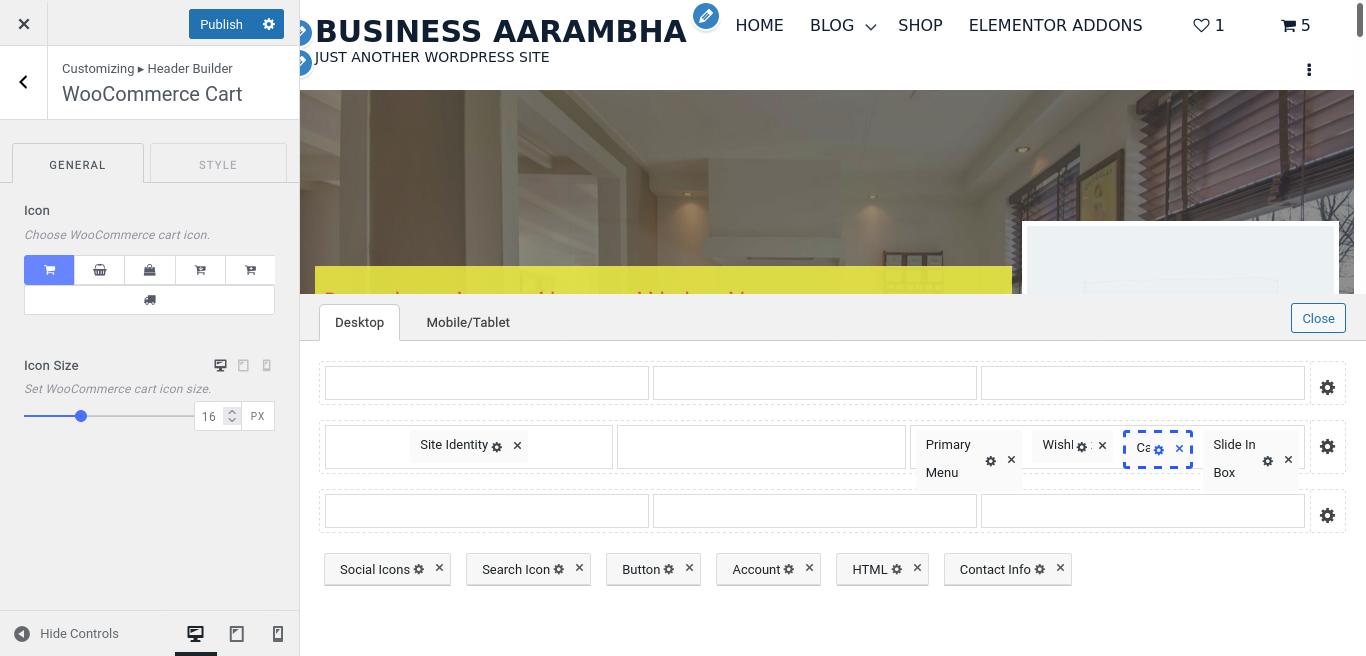
To add favorite items on wishlist, there is a menu called WooCommerce Wishlist.
- You can set WooCommerce wishlist icon.
- Set WooCommerce wishlist icon size, color, background.
- Change WooCommerce wishlist box shadow.
- Set WooCommerce wishlist padding, margin.

In Header Banner, set banner size as container or full width.
- Set header banner type as normal banner or banner as slider or none.
- Set post query to load with specific category. It will load the latest post by default.
- Set banner max height.
- Set banner slide limit. Upgrade pro theme to unlock unlimited slide.
- Set header banner container background overlay as color or gradient colors.
- Set header banner container border.
- Set header banner container box shadow.
- Set header banner container padding
 .
.
Enable banner content image on Header Banner.
Customize Image position, gap, opacity, border, box shadow, and many more.

- Enable lists for blog post content elements and rearrange the order by drag and drop.
- Set banner content each element spacing.
- Set read more button top margin.
- Set banner post content vertical position as top, middle or bottom.
- Set banner post content horizontal position as left, center or right.
- Set banner post content text alignment as left, center or right.
- Set content wrapper max width.
- Set header banner container background overlay as color or gradient colors.
- Set header banner container border.
- Set header banner container padding.

- Set slider slide effect as fade or slide.
- Set slider slide speed in milliseconds.
- Toggle to enable/disable slider auto play.
- Toggle to enable/disable slider infinite scroll.
- Toggle to enable/disable slider pagination.
- Set vertical position, horizontal position.
- Toggle to enable/disable slider navigation.

Top Row has:
- Container Layout options: Standard, Full Width, Contained
- Set top row left column content position as left, center, right or between by choose below options.
- Set top row center column content position as left, center, right or between by choose below options.
- Set top row right column content position as left, center, right or between by choose below options.
- Set column divider. This setting only apply if row have two or more columns.

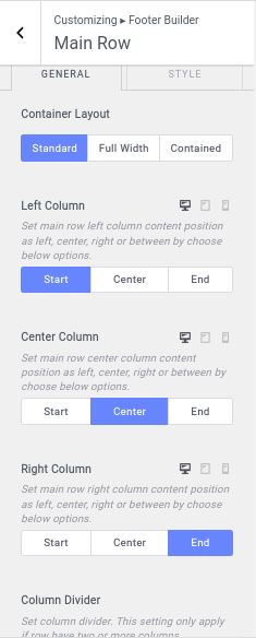
The Main Row also has:
- Container Layout Options: Standard, Full Width, Contained.
- Set main row left column content position as left, center, right or between by choose below options.
- Set main row center column content position as left, center, right or between by choose below options.
- Set main row right column content position as left, center, right or between by choose below options.
- Set column divider. This setting only apply if row have two or more columns.
Customize Bottom Row with:
- Container Layout: Standard, Full Width, Contained.
- Set bottom row left column content position as left, center, right or between by choose below options.
- Set bottom row center column content position as left, center, right or between by choose below options.
- Set bottom row right column content position as left, center, right or between by choose below options.
- Set column divider. This setting only apply if row have two or more columns.
- Set each column padding.
- Set footer bottom row container background image.
- Set footer bottom row container background overlay as color or gradient colors.
- Set footer bottom row border.
- Set footer bottom row padding.

You can insert some arbitrary HTML code tags: {current_year} and {site_title}. Also, toggle to enable link open in new window tab.
Configure social icons in Global» Social » Social Icons »
- To choose how you want to display social icons on your site, choose one from the Display As section.
- You can also set social icon positions as Before or After.
- Set gap between icon and text.
- Icon Size to set Social Icon size.
- Toggle to enable link open in new window tab.
- Social Container padding and margin.
- Icon and text color, background color, text typography.
- Item border, box-shadow, item margin, and padding.

Set button as text, icon, or both and add button URL as well as icons. Along with this, you can see multiple CSS options.
- GAP: To set the gap between icon and text.
- Icon Size: Set button icon size.
- Link Open: Toggle to enable link open in new window tab.
- Button: Set button color.
- Background: Set button background.
- Text Typography: Typography settings for text.
- Border: Set button border.
- Box Shadow: Set button box-shadow.
- Margin: Set button margin.
- Button Container: Customize button container margin and padding.

- Click add button to add a new button item.
- Toggle to enable link open in new window tab.
- Choose no. of Columns per row.
- Toggle to set row container width to 100%.
- Set button icon size and button gap between icon and title.
- Set each button icon and text color.
- Text Typography.
- Button icon border, margin, Padding.

To set menu, go to Footer Menu »
- Change value to set menu item spacing.
- Set menu normal and hover colors.
- Set menu each item background.
- Set menu text typography.
- Set menu each item border.
- Set menu each item box shadow.
- Set menu each item margin and padding.
- Set footer menu container background.
- Set menu container border.
- Set menu container margin and padding.

Go to Footer Builder > Widget Settings to customize widgets. There are multiple settings available:
- Widget Title: Set typography for footer widget title.
- Widget Content: Set typography for footer widget content.
- Padding: Set each footer widgets wrapper padding.

- Enable/disable scroll to top button from footer after window scroll.
- Choose back to bottom icon.
- Set back to top button position as left, center or right.
In Blog/Archive Posts, you will get to manage the following options as shown in the figure below;

Enable lists of page header elements and re-arrange their order by drag & drop with orders. Enable/Disable breadcrumb from page header bottom content.
As well as set the background image and background overlay color or gradient colors on page header container.

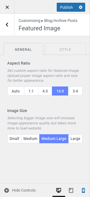
Manage Featured Image settings from Blog/Archive Posts > Featured Image:
- Set custom aspect ratio for featured image. Upload proper image aspect ratio and size for better appearance.
- Selecting bigger image size will increase image appearance quality but takes more time to load website.
You can set the limit for number of posts to load per page. It will apply all archive pages such as blog, categories, tags, search page. Similarly, enable lists for blog post content elements and rearrange the order by drag and drop.
- Set blog/archive page content category bottom spacing.
- Set blog/archive page content post title bottom spacing.
- Set blog/archive page content post meta bottom spacing.
- Set blog/archive page content post excerpt bottom spacing.
- Set blog/archive page content post read more bottom spacing.
- Set blog/archive page content post social share bottom spacing.
- Set element alignment to left, center, or right.
- Set each post content wrapper width.

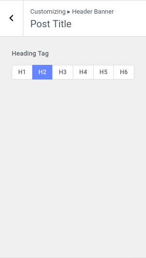
To manage the header size appropriately, select a suitable heading tag from Post Title.

The excerpt is to highlight the important part of your posts. So, choose your excerpt length wisely from Archive Posts > Post Excerpt. Likewise, you can decide what to put in the suffix of the excerpt. Toggle to enable link for the excerpt suffix text and set normal and hover color for suffix link.

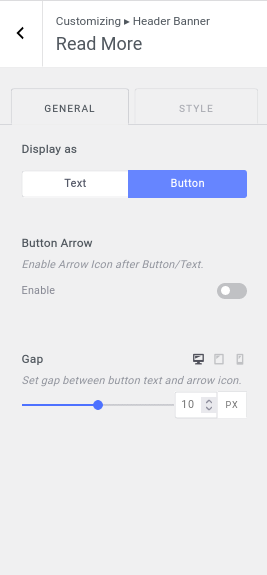
Visit Customizing > Archive Posts > Read More, to set Read More button/text. You can also enable Arrow Icon after Button/Text.

- Set pagination type: Next/Prev, Numeric, Load More Button, Infinite Scroll Button.
- Set top spacing for the pagination container.
- Customize Typography, text color.
- Button Background, border, box shadow, padding, etc.

- Sort Elements: Enable lists of social share and re-arrange their order by sorting with drag & drop.
- Post Meta Elements: Enable lists of post meta and re-arrange their order by sorting with drag & drop.
- Background Image: Set background image.
- Background Overlay: Set background overlay as color or gradient colors.
- Bottom Overlay Background: Set bottom overlay background color or gradient colors on page header container.

Like as other Featured Image Settings, choose aspect ratio, and image size, border, and box shadow for image.

In Post Content, there are following elements:
- Content Elements: Enable lists for single post content elements and rearrange the order by drag and drop.
- Elements Spacing: Set single post content each element spacing.
- Element Alignment: Set element alignment to left, center, or right.
- Wrapper Width: Set single post content wrapper width.
- Content After Elements: To display lists Elements after post content, enable them. And sort them by drag and drop.
- Background: Set post content wrapper background.
- Border: Set post content wrapper border.
- Box Shadow: Set post content wrapper box shadow.
- Padding: Set post content wrapper padding.
- Margin: Set post content wrapper margin.

Inside Post Title, choose separate heading tag and implement in different sections.
You can filter posts by Date, Category, or Tag inside Post Navigation. Also,
- Toggle to enable/disable next post and previous post label.
- Toggle to enable/disable next post and previous post arrow.
- Enable/Disable Post Title and Post thumbnail.
- Text color, background color, box shadow, etc.

- Enable lists of author box elements and re-arrange their order by drag & drop with orders.
- Set author detail each element spacing.
- Set gap between author image and author details wrapper.
- Set normal and hover color for author name, info and website.
- Set author container background color.
- Set author container border color, box shadow color.
- Set author container padding as well as container top and bottom margin.

From Related Posts section, you can manage:
- Show related posts by author, category or tag.
- no. of posts
- content settings (section heading, set section heading bottom spacing, columns per row.)
- Content Elements: Enable lists for related post content elements and rearrange the order by drag and drop.
- Elements Spacing: Set related post each element spacing.
- Element alignment
- Section Margin: set related posts section top and bottom margin.
- Set and reset related posts each post wrapper background color.
- box shadow, posts styling, and many more.

Manage the single page of your website with the following features available in Business Aarambha Pro.
Set the perfect size, position, aspect ratio, etc of your featured image from this section.
Page Content helps to manage Header Elements, Footer Elements, spacing on several elements etc.
You can customize the page header and content section of error page. You can call it, 404 page.

Enable lists of page header (main and bottom) elements and re-arrange their order by sorting with drag & drop.
Set Background image and overlay color or gradients for header container.
Enable lists of page content elements and re-arrange their order by drag & drop with orders. Customize elements spacing, select image for error page, title, subtitle, button text, etc.
Create Menus to your site and place them in different positions that is really suitable to represent your business.

Your theme can display menus in 3 locations. Select which menu appears in each location.
If your theme has widget areas, you can also add menus there. Visit the Widgets panel and add a “Navigation Menu widget” to display a menu in a sidebar or footer.

Your theme has 1 other widget area, but this particular page doesn’t display it.
You can navigate to other pages on your site while using the Customizer to view and edit the widgets displayed on those pages.

You can drag and drop different widgets into Footer Sidebar 1, 2, 3, 4, 5, and 6.
You can choose what’s displayed on the homepage of your site. It can be posts in reverse chronological order (classic blog), or a fixed/static page. To set a static homepage, you first need to create two Pages. One will become the homepage, and the other will be where your posts are displayed.

If you enable store notice, the text you added on the text field will be shown site-wide. You can use it to show events or promotions to visitors!

In Product Catalog settings,
- Choose what to display on the main shop page.
- Choose what to display on product category pages.
- Select product sorting method
- no of products per row
- no of row per page
- rating, category lists, excerpt
- Set product content each item spacing.
- text alignment, background, border, etc.
Go to WooCommerce > Product Images,
- After publishing your changes, new image sizes will be generated automatically.
- Images will display using the aspect ratio in which they were uploaded
- You can also add hover effects on images.

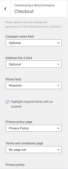
These options let you change the appearance of the WooCommerce checkout. Optionally add some text about your store privacy policy to show during checkout.

Inside WooCommerce > Single Product,
- Toggle to enable/disable sticky gallery and summary content.
- Customize image gallery width.
- Set each product gallery thumbnail spacing.
- Toggle to enable/disable lightbox to open image in popup.
- Toggle to enable/disable zoom effect while hover the product image.
- Customize product content (category, title, rating, price, excerpt, add to cart, or any extra content).
- You can also add feature lists and payment methods.

To add sale or stock badge, visit WooCommerce > Sale and Stock Badge,
- Toggle to enable/disable Sale badge label.
- Choose position for the content in the Center Column.
- Toggle to enable/disable Stock badge label.
- Add Label

Add your own CSS code here to customize the appearance and layout of your site. 

