
Zenvy
Table of Contents
Follow the steps below to get started with your WordPress Theme:
- Now log in to the WordPress admin dashboard.
- Go to Appearance> Themes > Add New > Upload theme.
- Upload zenvy.zip and Activate themes.
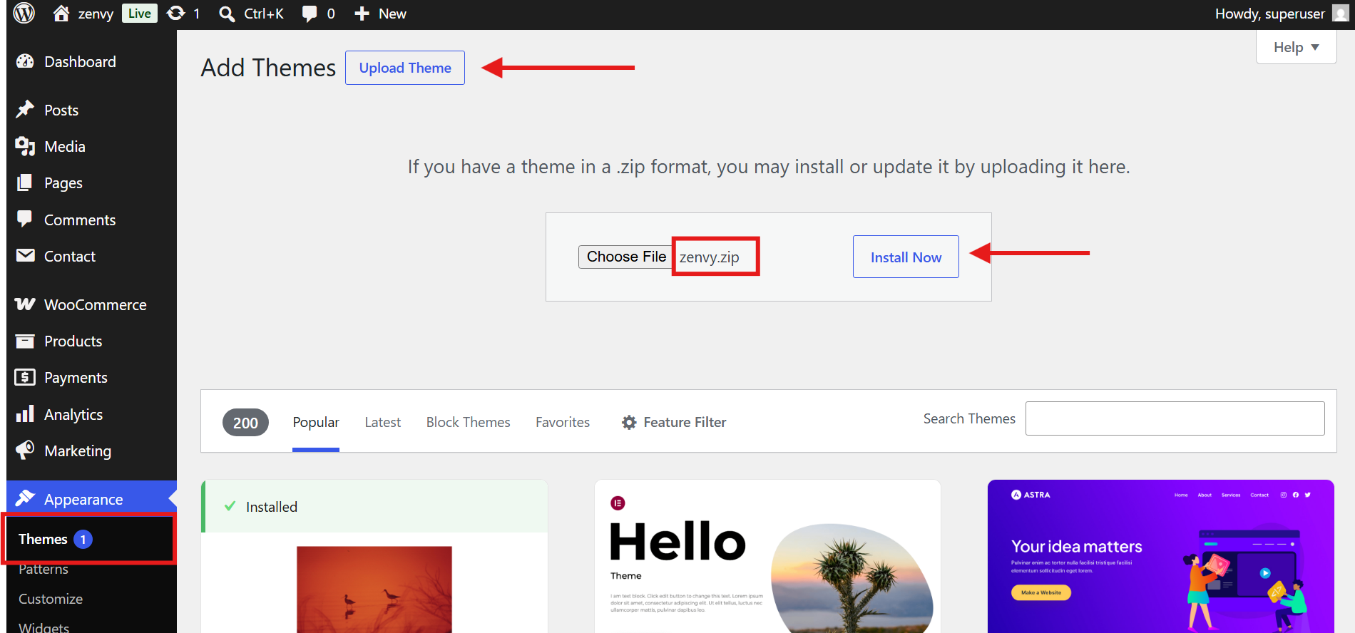
- After theme activation, you will get a notification to install and activate the required plugins.
- Click on Begin installing plugins.
- Install and Activate plugins.
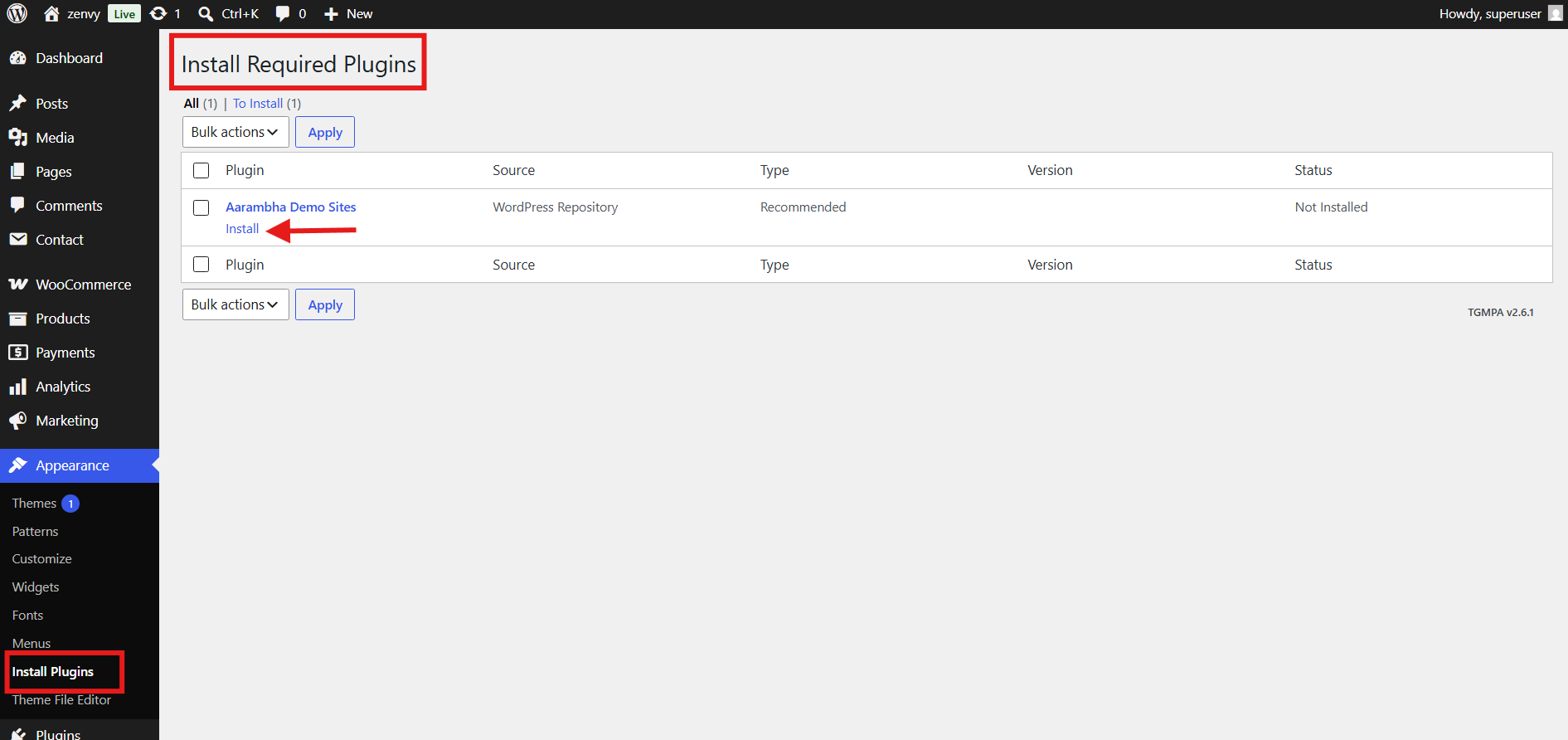
- Install and activate the Aarambha Demo Sites plugin. which helps you to import demo data on your site.
- After that, you will find the Import Demo menu in the dashboard.

Navigate to Appearance > Customize > Global to access global site settings. These settings affect the entire website and define the base styles.
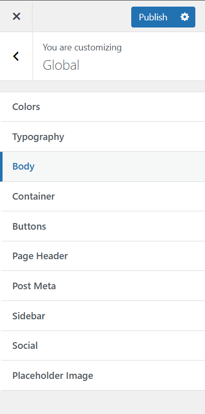
Path: Customize > Global > Colors
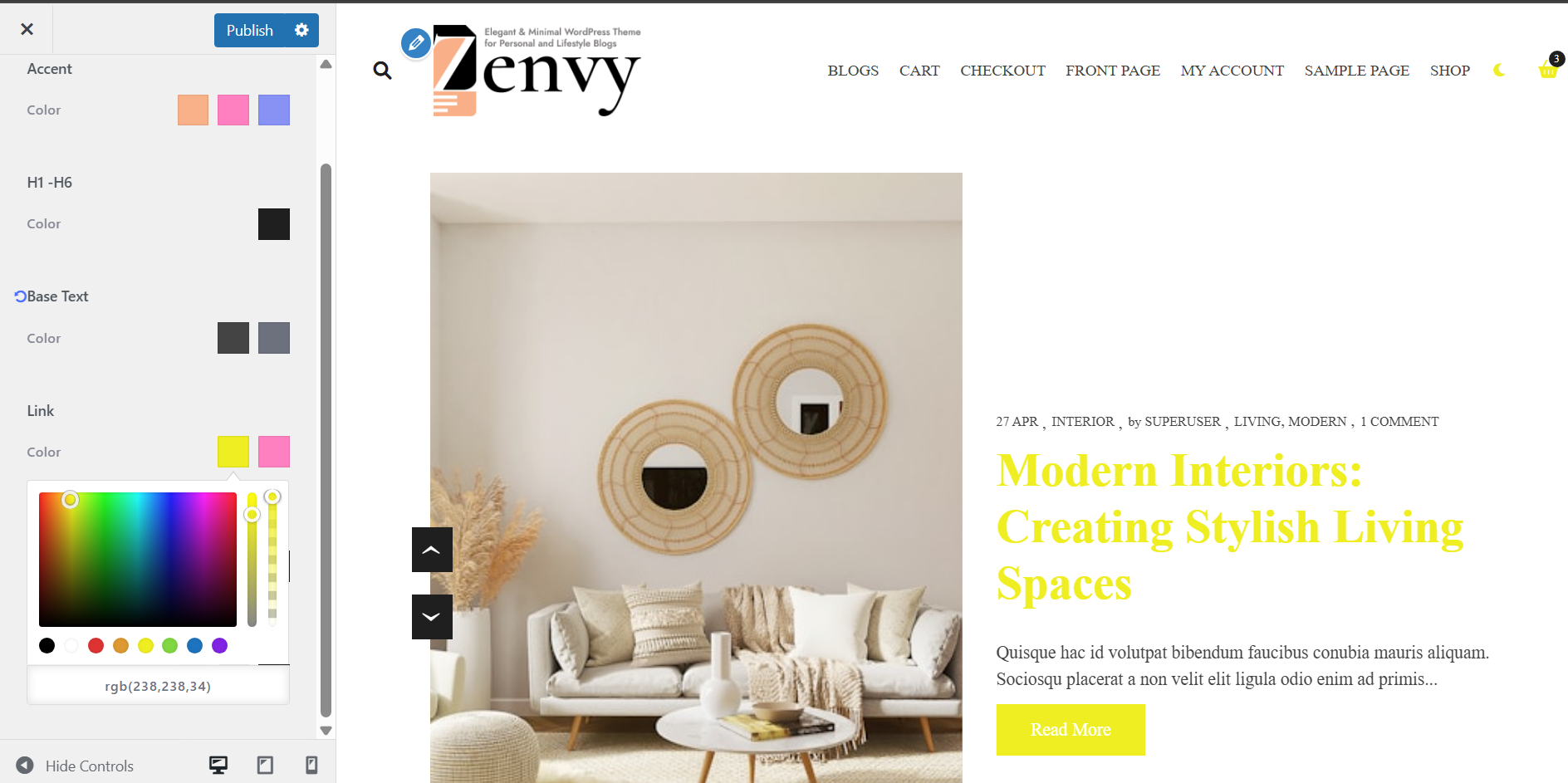
The Colors section allows you to set global color tokens that are applied consistently throughout the theme. Changing these updates all places that reference the corresponding CSS variables.
Setting
- Accent (Primary, Secondary, Tertiary): Sets the three main accent colors for the theme. Maps to –color-primary, –color-secondary, and –color-tertiary CSS variables.
- H1 – H6 Color: Sets the color for all heading elements (H1 through H6). Maps to –color-heading.
- Base Text (Color 1, Color 2): Sets the primary and secondary text colors. Maps to –color-text and –color-text-light.
- Link (Normal, Hover): Controls the normal and hover state colors of all links. Maps to –color-link and –color-link-hover.
- Border & Shadow (Border, Shadow): Sets global border and box-shadow colors. Maps to –color-border and –color-box-shadow.
- Background (Color 1, Color 2, Color 3): Sets the three background shades used across the theme. Maps to –color-bg, –color-bg-light, and –color-bg-dark.
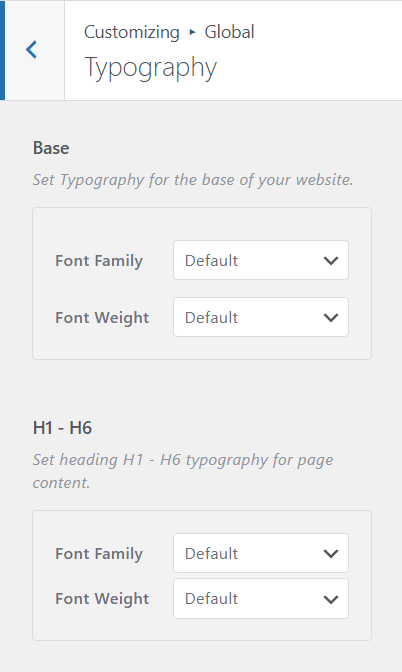
Path: Customize > Global > Typography
Controls the base and heading font families and weights for the entire site.
Setting
- Base Font: Sets the font family and font weight (variant) for all body text across the site.
- H1 – H6 Font: Sets the font family and font weight for all heading elements (H1 to H6). Supports responsive settings for desktop, tablet, and mobile.
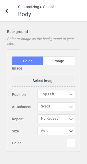
Path: Customize > Global > Body
Controls the site-wide background appearance
Setting
- Background: Set a color or image as the site background. Options include: color, image upload, position, attachment (fixed/scroll), repeat, and size.
Path: Customize > Global > Container
Controls the maximum width of the site’s content container.
Setting
- Max Width: Set the maximum width of the site container. Default is 1170px. Accepts values between 0 and 2000px.

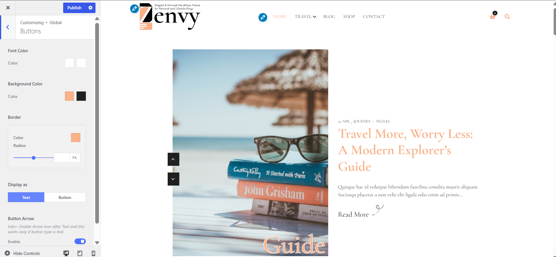
Path: Customize > Global > Buttons
Globally styles all buttons across the site.
Setting
- Font Color (Normal / Hover): Set the button text color for normal and hover states.
- Background Color (Normal / Hover): Set the button background color for normal and hover states.
- Border: Set the button border including color and border radius
- Display As: Choose whether to display the Read More link as plain text or as a styled button globally, later on you can set this setting as default.
- Button Arrow: Toggle to show or hide an arrow icon after the Read More text.
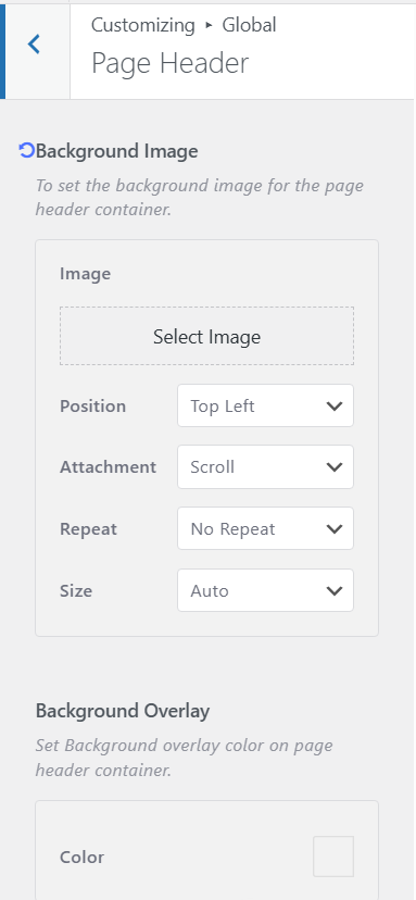
Path: Customize > Global > Page Header
Controls the appearance of the page header area shown on archive, single post, and other pages (where enabled).
Setting
- Background Image: Upload and configure a background image for the page header. Options include position, attachment, repeat, and size.
- Background Overlay: Set a color overlay on top of the page header background. Defaults to –color-bg-light.
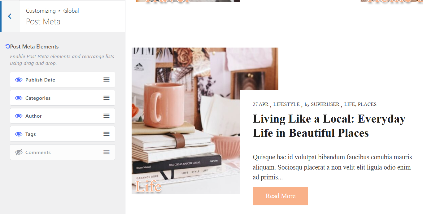
Path: Customize > Global > Post Meta
Controls which post meta elements are displayed, and their order. Uses drag-and-drop sorting.
Setting
- Post Meta Elements: Enable or disable individual meta items and reorder them via drag-and-drop. Available elements: Author, Categories, Tags, Publish Date, Comments.
Path: Customize > Global > Sidebar
Setting
- Sticky Sidebar: Toggle to enable a sticky sidebar that remains in view as the user scrolls through the page content. Disabled by default.

Path: Customize > Global > Social
This is where you configure and manage all social icon links used throughout the site. Once added here, the social icons can be displayed in the Header or Footer using the respective builders. Add new social media using the Add new Social button and reorder by dragging and dropping.
ℹ Social icons configured here are shared between the Header Builder > Social Icons and Footer Builder > Social Icons elements.

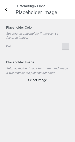
Path: Customize > Global > Placeholder Image
Defines what is shown when a post does not have a featured image.
Setting
- Placeholder Color: Set a fallback color to display when no featured image is available. Default is #dbdcdf.
- Placeholder Image: Upload a fallback image for posts without a featured image. When set, this overrides the placeholder color.
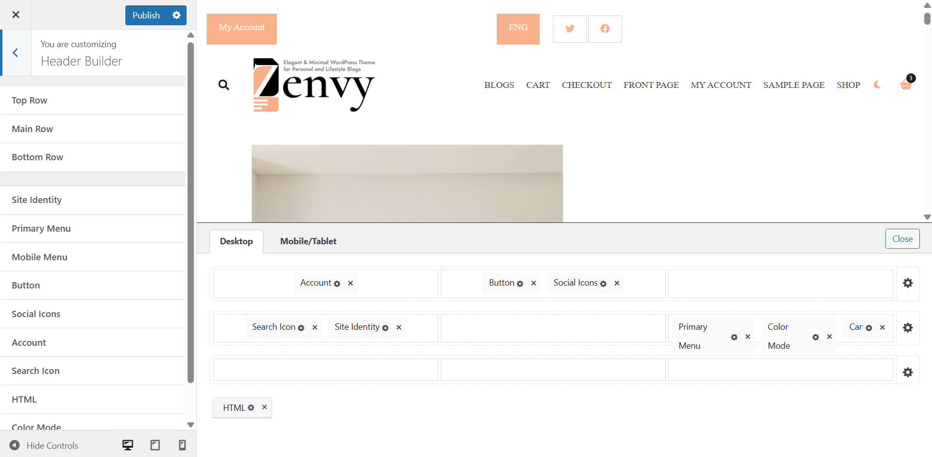
Path: Customize > Header Builder
The Header Builder is a drag-and-drop interface that lets you arrange elements in three rows: Top, Main, and Bottom. Each row has three columns (Left, Center, Right). Elements can be dragged from the element tray at the bottom of the builder into any column position.
Available Header Elements:
- Site Identity (Logo / Site Title / Tagline)
- Primary Menu
- Mobile Menu
- Button
- Social Icons
- Account
- Search Icon
- HTML
- Color Mode
- WC Cart (WooCommerce only)
Path: Customize > Header Builder > Top Row
Applies to the topmost row of the header. Shares the same layout and style settings as the Main and Bottom rows.
Setting
- Min Height: Set the minimum height of the row (responsive: desktop, tablet, mobile). Drag the slider to adjust.
- Left Column Alignment: Choose content alignment inside the left column: Start, Center, or End. Responsive per device.
- Center Column Alignment: Choose content alignment inside the center column: Start, Center, or End. Responsive per device.
- Right Column Alignment: Choose content alignment inside the right column: Start, Center, or End. Responsive per device.
- Background Overlay (Style tab): Add a solid color overlay to the row’s background for better visibility and styling.

Path: Customize > Header Builder > Main Row
The primary/central header row. Default minimum height is 80px. Shares identical settings to the Top and Bottom rows.

Path: Customize > Header Builder > Bottom Row
The bottom row of the header. Shares identical settings to the Top and Main rows.

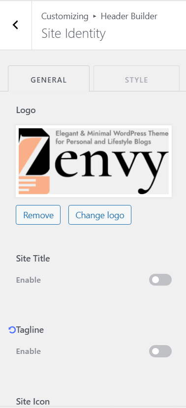
Path: Customize > Header Builder > Site Identity
Controls the logo, site title, tagline, and site icon.
General Tab:
- Logo: Upload your site logo image using the WordPress media library.
- Site Title (Toggle): Enable or disable the display of the site title text next to or below the logo.
- Site Title (Text): The site title text is pulled from WordPress Settings > General > Site Title.
- Tagline (Toggle): Enable or disable the display of the site tagline.
- Tagline (Text): The tagline text is pulled from WordPress Settings > General > Tagline.
- Site Icon: Upload a favicon/site icon shown in browser tabs. Recommended size: 512x512px.
Style Tab:
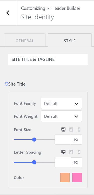
- Site Title Typography: Set font family, size, letter spacing, and colors (normal/hover) for the site title. Responsive for desktop, tablet, mobile.
- Tagline Typography: Set font size and color for the tagline text.
- Padding: Adjust the inner padding of the site identity container.
- Margin: Adjust the outer margin of the site identity container.
Path: Customize > Header Builder > Primary Menu
ℹ To assign a menu, go to Customize > Menus and assign a menu to the Primary Menu location.
General Tab:
- Menu Spacing: Set the spacing between parent-level menu items. Responsive for desktop, tablet, mobile.

Style Tab:
- Colors (Normal / Hover) Parent: Set the text color for parent menu items in normal and hover states.
- Background (Normal / Hover) Parent: Set the background color of parent menu items in normal and hover states.
- Colors (Normal / Hover) Child: Set the text color for child/dropdown menu items in normal and hover states.
- Background Colors (Normal / Hover) Child: Set the background color of child menu items in normal and hover states.
- Border: Set border width and color for the child menu dropdown container.
- Container Padding: Set inner padding around the primary menu container.
- Container Margin: Set outer margin around the primary menu container.

Path: Customize > Header Builder > Mobile Menu
ℹ To assign a menu for mobile, go to Customize > Menus and assign a menu to the Mobile Menu location.
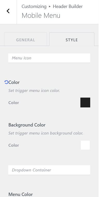
Style Tab – Menu Icon (Hamburger):
- Color: Set the color of the hamburger/toggle menu icon.
- Background Color: Set the background color behind the toggle icon.
Style Tab – Dropdown Container:
- Menu Color: Set the text color for mobile menu items and sub-items.
- Menu Background (Normal / Hover): Set the background color of mobile menu items in normal and hover states. Default normal: rgba(0,0,0,0.8).
- Padding: Set inner padding of the mobile menu toggle container.
- Margin: Set outer margin of the mobile menu toggle container.
Path: Customize > Header Builder > Button
Adds a custom button element to the header. Useful for a CTA or language switcher.
General Tab:
- Text: The label text displayed on the button. Default: ‘ENG’.
- URL: The link URL the button points to. Default: ‘#’.
- Link Open: Toggle to open the button link in a new tab.

Style Tab:
- Button Color (Normal / Hover): Set the button text/label color for normal and hover states.
- Background (Normal / Hover): Set the button background color for normal and hover states.
- Button Padding: Set the inner padding of the button itself. Default: 12px top/bottom, 18px left/right.
- Container Padding: Set the padding around the button container element.
- Container Margin: Set the margin around the button container element.

Path: Customize > Header Builder > Social Icons
ℹ Social icon links must first be configured in Global > Social before they appear in the header.
General Tab:
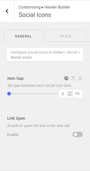
- Item Gap: Set the gap (spacing) between individual social icon items. Range: 0–50px. Responsive.
- Link Open: Toggle to open all social icon links in a new browser tab.
Style Tab – Container:
- Padding: Set inner padding around the social icons container.
- Margin: Set outer margin around the social icons container.
Style Tab – Item:
- Icon Color (Normal / Hover): Set the icon color for each social icon in normal and hover states.
- Background (Normal / Hover): Set the background color behind each icon in normal and hover states.
- Padding: Set padding for each individual icon item. Default: 11px top/bottom, 18px left/right.
- Border: Set border width and color for each icon item.

Path: Customize > Header Builder > Account
Displays an account login/logout button in the header. Shows different text and URL depending on the user’s logged-in state.
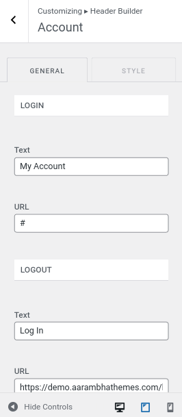
General Tab – Login:
- Text: Label shown when the user is logged in. Default: ‘My Account’.
- URL: The destination URL for logged-in users.
General Tab – Logout (shown when logged out):
- Text: Label shown when the user is logged out. Default: ‘Log In’.
- URL: The destination URL for logged-out users (e.g., the WordPress login page).
General Tab – Settings:
- Link Open: Toggle to open the account link in a new tab.
Style Tab:
- Container Padding: Set inner padding for the account element container.
- Container Margin: Set outer margin for the account element container.
- Account Color (Normal / Hover): Set the account button text color.
- Background (Normal / Hover): Set the account button background color.
- Padding: Set inner padding of the account button. Default: 12px top/bottom, 18px left/right.
Path: Customize > Header Builder > Search Icon
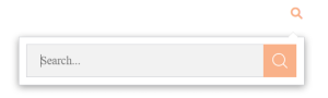
Adds a search icon to the header that opens a popup/modal search overlay when clicked.
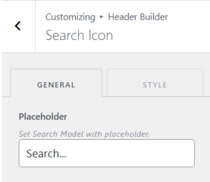
General Tab:
- Placeholder: Set the placeholder text shown inside the search modal input field. Default: ‘Search…’.
Style Tab:
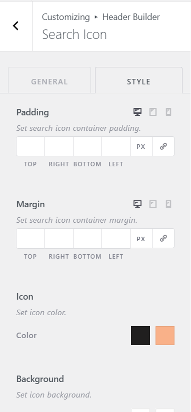
- Container Padding: Set inner padding for the search icon container.
- Container Margin: Set outer margin for the search icon container.
- Icon Color (Normal / Hover): Set the search icon color in normal and hover states.
- Background (Normal / Hover): Set the background of the search icon in normal and hover states.
- Button Background (Normal / Hover): Set the background color of the search submit button inside the popup.
- Padding: Set inner padding of the search icon button itself. Default: 11px top/bottom, 18px left/right.
Path: Customize > Header Builder > HTML
Allows you to insert arbitrary text or HTML markup into the header area.
General Tab:
- HTML: Enter custom text or HTML code using the rich text editor. Standard HTML tags and inline styles are supported.

Style Tab:
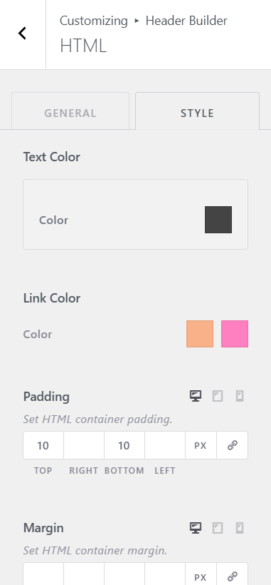
- Text Color: Set the text color for the HTML content.
- Link Color (Normal / Hover): Set the color for links within the HTML content, in normal and hover states.
- Padding: Set inner padding for the HTML container. Default: 10px top and bottom.
- Margin: Set outer margin for the HTML container.
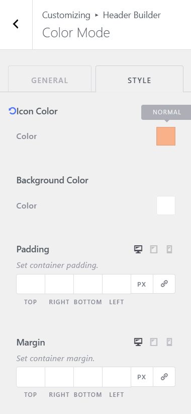
Path: Customize > Header Builder > Color Mode
Adds a dark/light mode toggle button to the header.
General Tab:
- Icon Size: Set the size of the dark/light mode toggle icon. Default: 13px. Responsive.

Style Tab:
- Icon Color: Set the color of the mode-switch icon.
- Background Color: Set the background color behind the icon.
- Padding: Set inner padding for the color mode container.
- Margin: Set outer margin for the color mode container.
Path: Customize > Header Builder > WC Cart
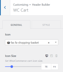
Adds a WooCommerce shopping cart icon to the header. Only available when WooCommerce is installed and active.
General Tab:
- Icon: Choose from a selection of cart icon styles: Shopping Cart, Shopping Basket, Shopping Bag, Cart Arrow Down, Cart Plus, Truck.
- Icon Size: Set the size of the cart icon. Default: 16px. Responsive.
Style Tab:
- Cart Icon Color (Normal / Hover): Set the cart icon color.
- Cart Background (Normal / Hover): Set the background color of the cart icon area.
- Cart Count Color: Set the color of the item count badge text.
- Cart Count Background: Set the background color of the item count badge.
- Padding: Set inner padding of the cart element. Default: 12px top/bottom, 18px left/right.
- Margin: Set outer margin of the cart element.
Path: Customize > Footer Builder
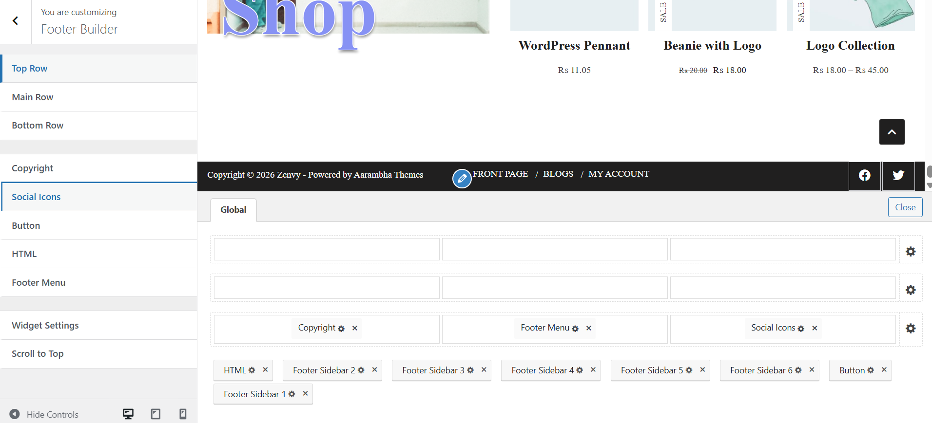
Similar to the Header Builder, the Footer Builder allows drag-and-drop placement of elements across three rows: Top, Main, and Bottom. Each row has three columns (Left, Center, Right).
Available Footer Elements:
- Copyright
- Social Icons
- Button
- HTML
- Footer Menu
- Widget Areas (6 footer widget sidebars)
- Scroll to Top
Row Settings (applies to Top Row, Main Row, and Bottom Row):
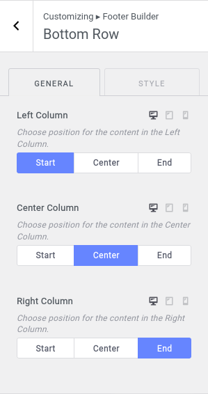
- Left Column Alignment: Set content alignment (Start, Center, End) in the left column.
- Center Column Alignment: Set content alignment in the center column.
- Right Column Alignment: Set content alignment in the right column.
- Background Overlay (Style): Set a solid color overlay on the row background. Useful for dark footer styles.
- Padding (Style): Set top/bottom and left/right padding for the row.
Path: Customize > Footer Builder > Top Row
The topmost footer row. Default background overlay is set to –color-bg-dark. Default padding: 25px top/bottom.

Path: Customize > Footer Builder > Main Row
The central footer row. Shares the same settings structure as the Top Row.

Path: Customize > Footer Builder > Bottom Row
The lowermost footer row. Shares the same settings structure as the Top and Main rows.
Path: Customize > Footer Builder > Copyright
Displays copyright text in the footer. Supports dynamic template tags.
General Tab:
- Copyright Text: Enter the copyright text. Supports HTML and template tags. Default: ‘Copyright {copyright} {current_year} {site_title}’. Available tags: {current_year} – inserts the current year automatically; {site_title} – inserts the site name.
- Link Open: Toggle to open any links inside the copyright text in a new tab.

Style Tab:
- Text Color (Normal / Link Hover): Set the copyright text color and the link hover color.
- Padding: Set inner padding for the copyright element. Default: 10px top/bottom.
- Margin: Set outer margin for the copyright element.

Path: Customize > Footer Builder > Social Icons
ℹ Social icon links must first be configured in Global > Social.
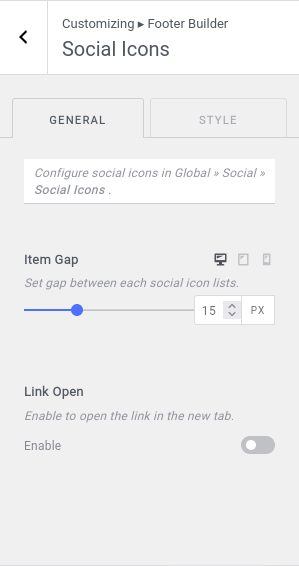
General Tab:
- Item Gap: Set the spacing between social icons. Range: 0–50px.
- Link Open: Toggle to open all social links in a new tab.
Style Tab – Container:
- Padding: Set inner padding around the social icons container.
- Margin: Set outer margin around the social icons container.
Style Tab – Item:
- Icon/Text Color (Normal / Hover): Set the icon and text color for each social icon.
- Background (Normal / Hover): Set the background color behind each icon. Default: –color-bg-dark.
- Padding: Set padding for each icon item. Default: 10px top/bottom, 15px left/right.

Path: Customize > Footer Builder > Button
Adds a custom call-to-action button to the footer.
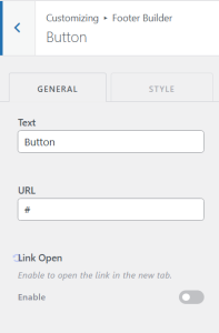
General Tab:
- Text: The label text on the button. Default: ‘Button’.
- URL: The destination URL for the button link.
- Link Open: Toggle to open the link in a new tab.
Style Tab:
- Button Color (Normal / Hover): Set the button text color.
- Background (Normal / Hover): Set the button background color.
- Border: Set button border width and color.
- Padding: Set inner padding of the button. Default: 7px top/bottom, 15px left/right.
- Margin: Set outer margin of the button. Default: 5px all sides.
Path: Customize > Footer Builder > HTML
Inserts custom text or HTML markup into a footer column.
General Tab:
- HTML: Enter custom text or HTML content using the rich text editor.

Style Tab:
- Text Color: Set the text color for the HTML block. Default: –color-white.
- Link Color (Normal / Hover): Set colors for links within the HTML content.
- Padding: Set inner padding for the HTML block. Default: 10px top/bottom.
- Margin: Set outer margin for the HTML block.
Path: Customize > Footer Builder > Footer Menu
ℹ To assign a menu, go to Customize > Menus and assign a menu to the Footer Menu location.
General Tab:
- Menu Spacing: Set the spacing between footer menu items. Responsive for desktop, tablet, mobile.

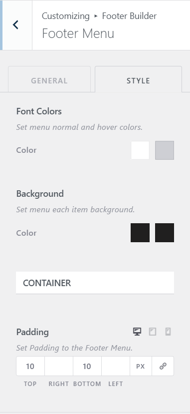
Style Tab:
- Font Colors (Normal / Hover): Set the menu item text color in normal and hover states. Default: white / gray.
- Background (Normal / Hover): Set the background color for each menu item. Default: –color-bg-dark.
- Container Padding: Set inner padding for the footer menu container. Default: 10px top/bottom.
- Container Margin: Set outer margin for the footer menu container.
Path: Customize > Footer Builder > Widget Settings
The Footer Builder includes 6 Footer Widget Areas (Footer Sidebar 1–6). Widgets can be added to these areas via Appearance > Widgets. The widget appearance can be customized here.
Setting
- Widget Title Color: Set the color of widget heading/title text. Default: –color-white.
- Widget Content Color (Normal / Hover): Set the text and link colors for widget content.
- Padding: Set inner padding around each footer widget wrapper.

Path: Customize > Footer Builder > Scroll To Top
Setting
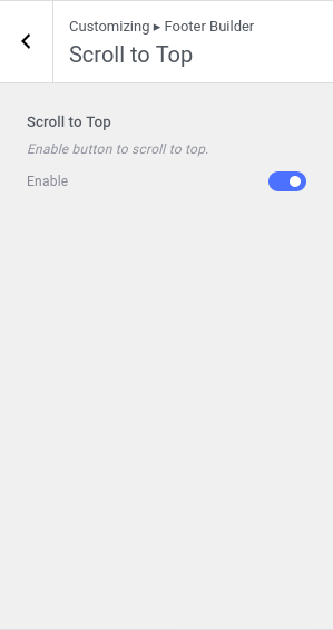
- Scroll to Top: Toggle to enable or disable a ‘scroll to top’ button that appears after the user scrolls down the page. Enabled by default.
Path: Customize > Archive Posts
Controls the appearance and layout of blog archive pages, category pages, tag pages, and other post listing pages.
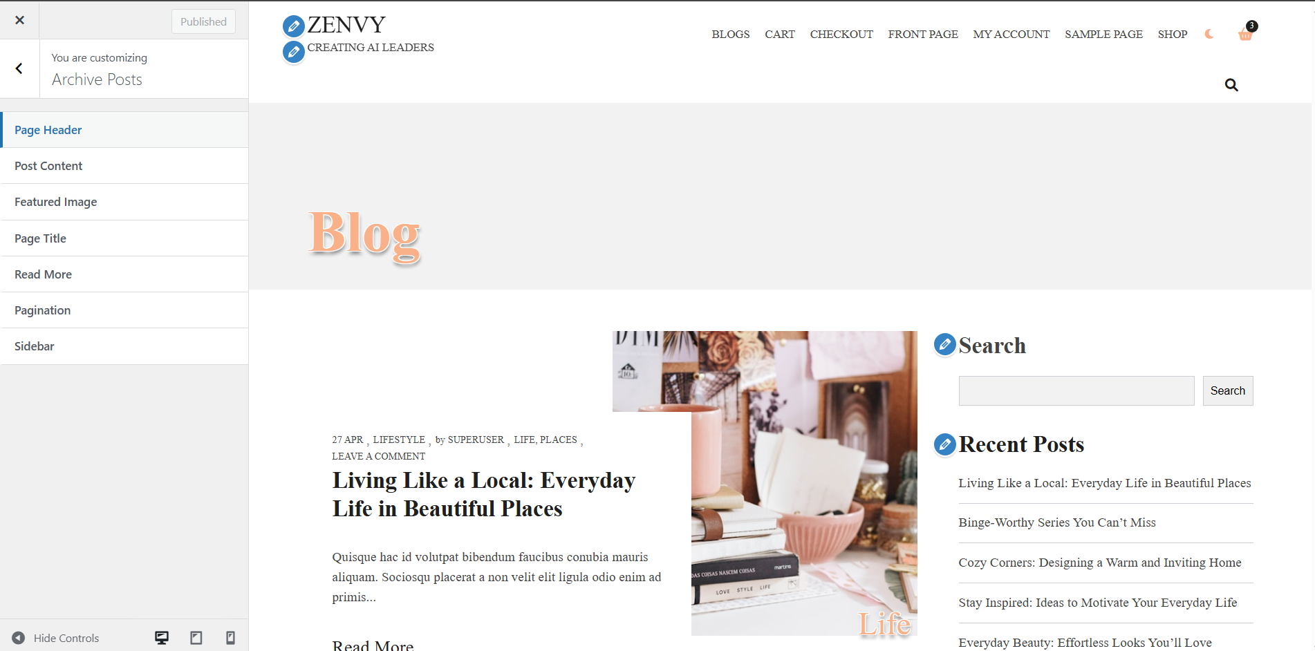
Path: Customize > Archive Posts > Page Header
Controls which elements appear in the archive page header and their order.
Setting:
- Sort Elements: Enable or disable and reorder page header elements via drag-and-drop. Available elements may include Page Title and Breadcrumb.

Path: Customize > Archive Posts > Post Content
Controls which elements appear within each post card on the archive page, and their order.
Setting:
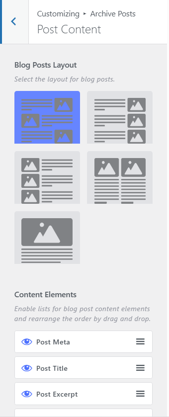
- Blog Posts Layout: Choose the post listing layout: Grid, List, Left, Right or Alt layout.
- Content Elements: Enable/disable and reorder elements shown at the bottom of each post card (e.g. Title, read more, excerpt).
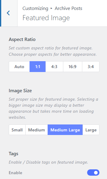
Path: Customize > Archive Posts > Featured Image
Setting:
- Aspect Ratio: Choose the aspect ratio for featured images in archive listings to maintain a consistent card layout.
- Image Size: Select the image size to use for archive featured images. Larger sizes improve quality but increase load time.
- Tags: Toggle to enable or disable post tags displayed as overlay badges on featured images.
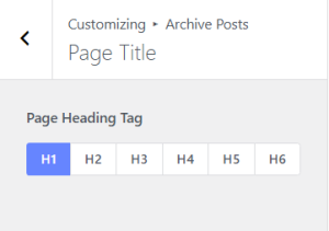
Path: Customize > Archive Posts > Page Title
Setting:
- Heading Tag: Select the HTML heading tag (H1–H6) used for the archive page title element.
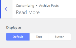
Path: Customize > Archive Posts > Read More
Setting:
- Display As: Choose whether to display the Read More link as plain text, as a styled button or use the default from Global > Button.
Path: Customize > Archive Posts > Pagination
Setting:
- Pagination Type: Choose between Next/Prev style pagination or numbered (numeric) pagination.

Path: Customize > Archive Posts > Sidebar
Setting:
- Sidebar Layout: Choose the sidebar position for archive pages: Left Sidebar, Right Sidebar, or No Sidebar.

Path: Customize > Single Post
Controls the layout and appearance of individual blog post pages.

Path: Customize > Single Post > Page Header
Setting
- Sort Elements: Enable, disable, and reorder page header elements via drag-and-drop.

Path: Customize > Single Post > Post Content
Setting
- Header Elements: Enable/disable and reorder elements displayed at the top of the post content area (e.g. post title, post meta, featured image).
- Footer Elements: Enable/disable and reorder elements displayed at the bottom of the post content area (e.g. tags, author bio, comments).

Path: Customize > Single Post > Post Title
Setting
- Heading Tag: Select the HTML heading tag (H1–H6) to use for the post title in the header area.

Path: Customize > Single Post > Featured Image
Setting
- Aspect Ratio: Set a custom aspect ratio for the single post featured image.
- Image Size: Choose the image size to use. Larger sizes improve visual quality but increase load time.

Path: Customize > Single Post > Sidebar
Setting
- Sidebar Layout: Choose the sidebar position for single post pages: Left, Right, or No Sidebar.

Path: Customize > Front Page
Controls all sections of the static front page. These settings only apply when a static front page is set in WordPress Settings > Reading (or Customize > Homepage Settings).

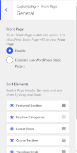
Path: Customize > Front Page > General
Setting
- Enable Front Page: Requires WordPress to be configured to show a static page as the front page (Settings > Reading > Your homepage displays > A static page). After enabling the toggle you can use predesigned theme frontpage sections.
- Sort Elements: Enable/disable and reorder all front page sections using drag-and-drop. Sections can be turned on or off without deleting their settings.
Path: Customize > Front Page > Featured Section
Displays a post slider featuring posts from a selected tag.
Setting
- Tag to be Featured: Select a post tag. Posts with this tag will appear in the featured slider.
- Number of Featured Posts: Set how many posts are displayed in the featured slider.
- Tags: Toggle to show or hide post tag badges on the featured images.
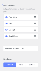
- Post Elements: Choose which elements to display on each slide (post meta, title, excerpt, buttons). Reorder via drag-and-drop.
- Read More Button: Choose to display the Read More link as a button, as plain text or use the default from Global > Button.
- Background (Style tab): Set the background color or image for the featured section container
.
Path: Customize > Front Page > Explore Categories Section
Displays a slider of post categories, each with a representative image.
Setting
- Section Title: Enter the heading text shown above the categories slider.
- Categories (Repeater): Add category entries using the repeater control. Each entry supports a category selection and associated image.
- Background Image / Overlay (Style tab): Set a background image and/or overlay color for the section.

Path: Customize > Front Page > Latest Posts Section
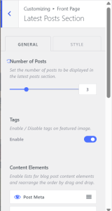
Setting
- Number of Posts: Set how many latest posts to display using the range slider.
- Post Elements: Choose and reorder which elements appear on each post card.
- Tags on Featured Image: Toggle to show post tags as overlay badges on featured images
- Read More Button: Choose to display the Read More link as a button, as plain text or use the default from Global > Button.
- Section Sidebar: Enable a section-specific sidebar. Add widgets to the ‘Front Page: Latest Posts’ sidebar area to display content alongside the post grid.
- Background / Overlay (Style tab): Set background image and color overlay for the section.
Path: Customize > Front Page > Testimonial Quote Section
Displays a highlighted quote with attribution and a decorative background.
Setting
- Quote: Enter the testimonial or quote text.
- Quoter: Enter the name or attribution for the quote.
- Quote Background (Style tab): Set the background for the quote section (color or image).

Path: Customize > Front Page > Trending Post Section
Displays posts with the most comments, settings and styled similarly to the Latest Posts section.

Path: Customize > Front Page > Youtube Promotion
Displays up to three highlighted YouTube videos.
Setting
- Video Entries: Enter YouTube video URLs or embed details for each of the three video slots.
- Background (Style tab): Set a background color or image for the YouTube promotion section.

Path: Customize > Front Page > Shop Section
A WooCommerce product promotional section. Only visible when WooCommerce is active.
Setting
- Section Entries: Fill in the section details like title, button text, etc.
- Background (Style tab): Set the background for the shop section.

Path: Customize > Single Page
Controls the layout and appearance of individual WordPress pages (not posts).

Path: Customize > Single Page > Page Header
Setting
- Sort Elements: Enable, disable, and reorder page header elements via drag-and-drop.
- Post Title: Toggle to display the page title in the page header area.
- Breadcrumb: Toggle to show breadcrumb navigation in the page header.

Path: Customize > Single Page > Page Content
Setting
- Header Elements: Enable/disable the Page Title element in the content area header.
- Footer Elements: Enable/disable Comments at the bottom of the page content.

Path: Customize > Single Page > Page Title
Setting
- Heading Tag: Select the HTML heading tag (H1–H6) for the page title in the content area.

Path: Customize > Single Page > Featured Image
Setting
- Aspect Ratio: Set a custom aspect ratio for the page’s featured image.
- Image Size: Choose the WordPress image size to use for the featured image on single pages.
- Tags: Enable and disable tags over featured image.

Path: Customize > Single Page > Sidebar
Setting
- Sidebar Layout: Choose the sidebar layout for single pages: Left Sidebar, Right Sidebar, or No Sidebar.

Path: Customize > 404 Page
Controls the appearance of the 404 error page, which is displayed when a visitor navigates to a URL that does not exist on the site.

Path: Customize > 404 Page > Page Header
Setting
- Sort Elements: Enable/disable and reorder page header elements via drag-and-drop (e.g. breadcrumb, title).

Path: Customize > 404 Page > Page Content
Setting
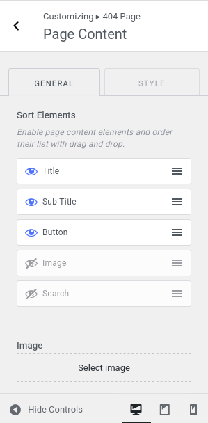
- Sort Elements: Enable/disable and reorder content elements via drag-and-drop.
- Error Image: Upload a custom image to display on the 404 error page.
- Background (Style tab): Set background color or image for the 404 content area.
Path: Customize > Menus
Manage navigation menus for the site. Menus can be created, configured, and assigned to specific locations.
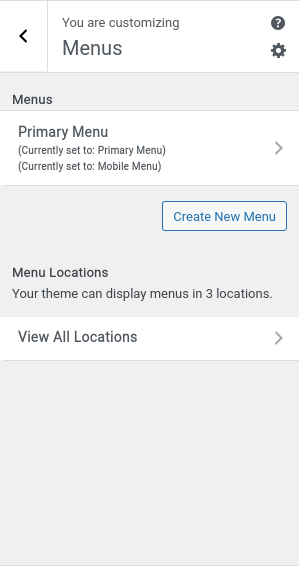
The Zenvy theme supports the following menu locations:
- Primary Menu – used in the Header Builder > Primary Menu element
- Mobile Menu – used in the Header Builder > Mobile Menu element
- Footer Menu – used in the Footer Builder > Footer Menu element

To create a new menu: go to Customize > Menus > Create New Menu, enter a name, and optionally assign it to a menu location.
Path: Customize > Widgets
The theme supports block-based widgets that can be added to the following widget areas:
- Sidebar – used on single posts and pages (when sidebar layout is enabled).
- Footer Sidebar 1 through Footer Sidebar 6 – used in the Footer Builder widget slots.
- Front Page: Latest Posts – used alongside the Latest Posts front page section.
- Front Page: Trending Posts – used alongside the Trending Posts front page section.
Each widget area supports all WordPress core and block-based widgets, including search bars, recent posts, categories, and custom HTML.

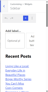
Display widgets on the footer section of the site. There are 6 footer sidebars that you can add to your website.

Path: Customize > Homepage Settings
Controls what is displayed on the front page of your site:
- Your latest posts – shows a classic chronological blog.
- A static page – shows a specific page as the front page. Requires creating two pages: one for the homepage and one to display blog posts.
ℹ The Front Page customizer sections only apply when a static page is selected here.

With Hompage dropdown options, you can select which page you want to make homepage/frontpage.


Path: Customize > Additional CSS
Allows you to add custom CSS rules to override or extend the theme’s default styles. CSS entered here is applied site-wide and persists through theme updates. Use browser DevTools to inspect element class names before writing overrides.

When editing any post or page in the WordPress block editor, a Post Settings meta box appears below the editor content area. This allows you to override the global customizer settings on a per-post or per-page basis without affecting the rest of the site.
To access it, open any post or page in the block editor and scroll below the content area to find the Meta Boxes section, then expand Post Settings.
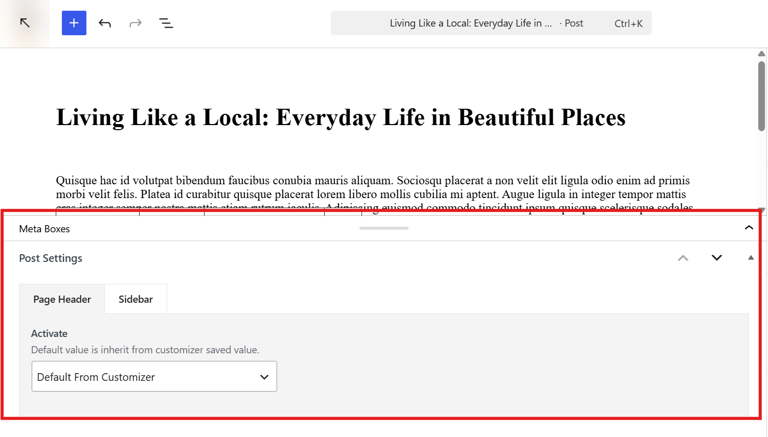
There are two tabs inside:
Page Header Tab
This tab controls whether the page header is shown for the individual post or page.
The Activate dropdown lets you choose how the page header behaves for this specific content. Setting it to Default From Customizer means the post will inherit whatever the global customizer setting is. You can override this per-post to force the page header on or off regardless of the global setting. This is useful when you want most pages to show a page header but need to hide it on specific landing pages, or vice versa.
Sidebar Tab
This tab controls the sidebar layout for the individual post or page.
The Sidebar Layout option presents four visual choices: From Customizer, Left Sidebar, Right Sidebar, and No Sidebar. Selecting From Customizer inherits the layout set in the global customizer (under Single Post or Single Page sidebar settings). Selecting any of the other three options overrides the global setting for that specific post or page only.
This is particularly useful for cases like hiding the sidebar on a specific long-form article, forcing a full-width layout on a custom landing page, or showing a left sidebar on one post while the rest of the site uses a right sidebar.